Every Picture Is a Compromise
Lessons from the Also-rans
Most photography websites show the photographer's very best work. Wonderful. But that's not the full story of a creative life. If we want to learn, we'd better pay attention to the images that aren't "greatest hits" and see what lessons they have to offer. Every picture is a compromise — the sum of its parts, optical, technical, visual, emotional, and even cosmic – well, maybe not cosmic, but sometimes spiritual. Success on all fronts is rare. It's ok to learn from those that are not our best.
This is a series about my also-rans, some of which I've been able to improve at bit (i.e., "best effort"), none of which I would consider my best. With each there are lessons worth sharing, so I will.
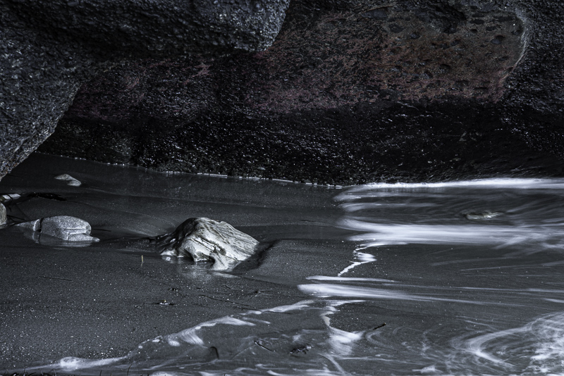
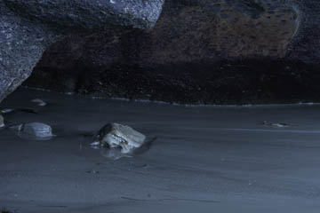
Original digital captureWhat I saw that I liked:I have no idea. Certainly the above has scarcely any virtue or potential. What I don't like in the picture:The waves coming in, however, added some small interest to the scene. But then the weird color balance (as seen in the above) was the result of "auto white balance" with my camera. Just awful. I've ignored this image in my Lightroom catalog for 16 years. What I learned:One day not long ago, I saw this image again and thought I'd practice a little PBPA (Photography By Pooping Around) to see if I could turn that awful color balance into something more interesting. The image at left is the result. To my eye, it looks like it's moonlit. Talk about making something out of nothing! I do wish, however, that I would have spent some more time here so I had a greater variety of wave patterns to choose from. 2nd Chances: What I might try nextNot really satisfied with this image, but it does give me ideas about what I might look for next time I'm out in a similar situation. |


