Every Picture Is a Compromise
Lessons from the Also-rans
Most photography websites show the photographer's very best work. Wonderful. But that's not the full story of a creative life. If we want to learn, we'd better pay attention to the images that aren't "greatest hits" and see what lessons they have to offer. Every picture is a compromise — the sum of its parts, optical, technical, visual, emotional, and even cosmic – well, maybe not cosmic, but sometimes spiritual. Success on all fronts is rare. It's ok to learn from those that are not our best.
This is a series about my also-rans, some of which I've been able to improve at bit (i.e., "best effort"), none of which I would consider my best. With each there are lessons worth sharing, so I will.
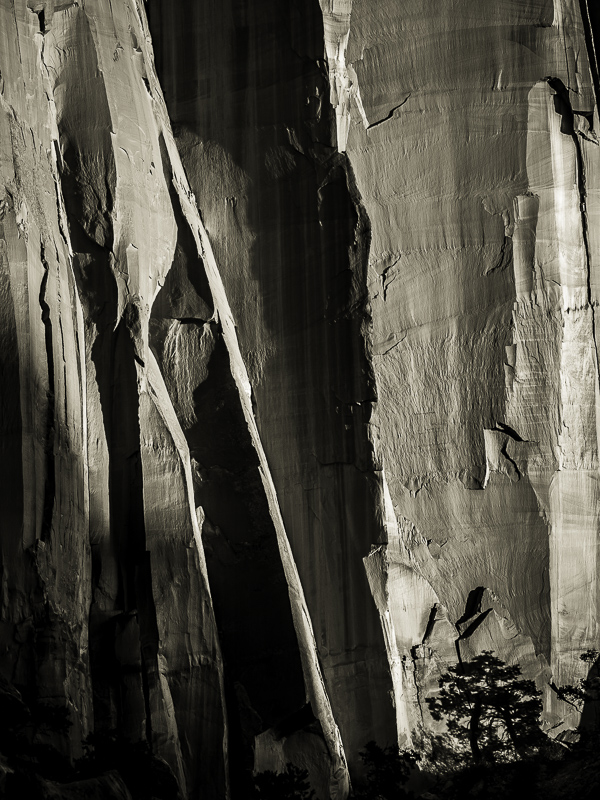
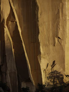
Original digital captureWhat I saw that I liked:Rock wall and tree just before sundown in Capitol Reef. What I don't like in the picture:The above image is an accurate rendition of the wall and light that was reflecting off of it. Normally, that's a good thing, but in this case it's simply unbelievable. Well, maybe you can believe it if you've been there and seen the canyon walls, but otherwise you would likely assume I've jacked up the color intensity for some photographic effect. I haven't, but it's easy to interpret it that I have. What I learned:In a rare case like this, I convert the image to an obvious b/w (toned to a bit of a warm tone) so I can avoid having the image misinterpreted as Photoshop on steroids. It's not the color that is so interesting in this shot, it's that rock wall, the textures and light, and the tree in the lower right corner. What an odd example where converting a color image to b/w makes it seem more real! |


