Every Picture Is a Compromise
Lessons from the Also-rans
Most photography websites show the photographer's very best work. Wonderful. But that's not the full story of a creative life. If we want to learn, we'd better pay attention to the images that aren't "greatest hits" and see what lessons they have to offer. Every picture is a compromise — the sum of its parts, optical, technical, visual, emotional, and even cosmic – well, maybe not cosmic, but sometimes spiritual. Success on all fronts is rare. It's ok to learn from those that are not our best.
This is a series about my also-rans, some of which I've been able to improve at bit (i.e., "best effort"), none of which I would consider my best. With each there are lessons worth sharing, so I will.
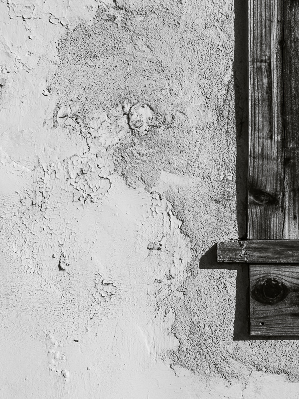
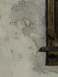
Original digital captureWhat I saw that I liked:I thought I might be able to make an interesting comparison between the adobe wall texture and the weathered wood of the window sill. What I don't like in the picture:Clearly, I was wrong. All I made was a mess. What I learned:The power if digital processing is amazing. I can push almost any tone to almost any lumiinance value I want. I can tweak colors to almost any degree my heart desires. (This is so different than in my wet darkroom days.) On the other hand, all the tonal and hue ajustments of my dreams can't overcome poor composition. In my film days, I spent huge amounts of effort to get the tones right and relatively little energy in the field working on compositional variations. Now, because tones and colors can be so precisely controlled in processing, I find the most useful attention I can apply in the field is working on subject selection, composition, and content. As it should be. |


