Every Picture Is a Compromise
Lessons from the Also-rans
Most photography websites show the photographer's very best work. Wonderful. But that's not the full story of a creative life. If we want to learn, we'd better pay attention to the images that aren't "greatest hits" and see what lessons they have to offer. Every picture is a compromise — the sum of its parts, optical, technical, visual, emotional, and even cosmic – well, maybe not cosmic, but sometimes spiritual. Success on all fronts is rare. It's ok to learn from those that are not our best.
This is a series about my also-rans, some of which I've been able to improve at bit (i.e., "best effort"), none of which I would consider my best. With each there are lessons worth sharing, so I will.
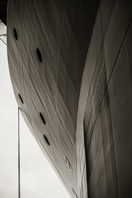
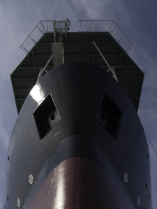
Original digital captureWhat I saw that I liked:Ships are very three-dimensional rounded things. Photographs are flat and linear things. What I don't like in the picture:In a lot of my images from the Dakota Creek Shipyard, the fundamental challenge was trying to show the roundness of the ship in the photographic medium. What I learned:Sometimes I could use modelling light around a curve the way I'd seen in Edward Weston nudes. Sometimes I could find an angle that showed a rounded shape. The best way, however, was by comparison. Thesee two images illustrate that method. In the above image, the rounded ship is contrasted to the hexagonal helipad just above the bow. In the image at left, the rounded side of the ship is contrasted to the straight cable hanging off the side. I kept searching for ways to make the ships look rounded and that was one of the most fun aspects of this project. 2nd Chances: What I might try nextCome to think of it, that could be a short project — Roundness in Steel. Well, maybe. |


