Every Picture Is a Compromise
Lessons from the Also-rans
Most photography websites show the photographer's very best work. Wonderful. But that's not the full story of a creative life. If we want to learn, we'd better pay attention to the images that aren't "greatest hits" and see what lessons they have to offer. Every picture is a compromise — the sum of its parts, optical, technical, visual, emotional, and even cosmic – well, maybe not cosmic, but sometimes spiritual. Success on all fronts is rare. It's ok to learn from those that are not our best.
This is a series about my also-rans, some of which I've been able to improve at bit (i.e., "best effort"), none of which I would consider my best. With each there are lessons worth sharing, so I will.
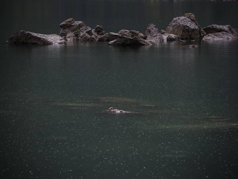
Original digital captureWhat I saw that I liked:Not the rocks, not the lake, it was the rain drops that I found interesting. What I don't like in the picture:The lack of contrast in the above makes the rain drops hardly visible. One way to make them more visible is to make a giant print. The other way is to . . . What I learned:. . . simply increase the contrast so the white drops become more visible against the darker water. Sometimes it's not what you see that counts, but what you want the viewers to see that drives the processing decisions. 2nd Chances: What I might try nextI might darken that water even more by using an HSL modification on the green color of the water. |


