Every Picture Is a Compromise
Lessons from the Also-rans
Most photography websites show the photographer's very best work. Wonderful. But that's not the full story of a creative life. If we want to learn, we'd better pay attention to the images that aren't "greatest hits" and see what lessons they have to offer. Every picture is a compromise — the sum of its parts, optical, technical, visual, emotional, and even cosmic – well, maybe not cosmic, but sometimes spiritual. Success on all fronts is rare. It's ok to learn from those that are not our best.
This is a series about my also-rans, some of which I've been able to improve at bit (i.e., "best effort"), none of which I would consider my best. With each there are lessons worth sharing, so I will.
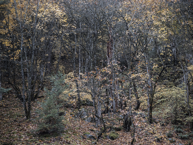
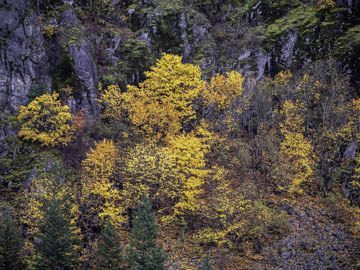
Original digital captureWhat I saw that I liked:Fall forest What I don't like in the picture:The above seems to be about the splash of vibrant color. In fact, most fall leaves photographs are about the splash of vibrant colors. What I learned:A splash of vibrant color makes an impactful impression on our nerve endings, a visual titillation of sorts. It's a sensual experience, but not a thoughtful one. For my money, I much prefer the image at left that is less about tickling our nerves and more about a place of being. I get tired of looking at the above; I get engrossed when looking at the image at left. I want to move on after the initial impression made above; I want to linger and just be there in the image at left. 2nd Chances: What I might try nextI've never printed the one at left. I need to do so. |


