Every Picture Is a Compromise
Lessons from the Also-rans
Most photography websites show the photographer's very best work. Wonderful. But that's not the full story of a creative life. If we want to learn, we'd better pay attention to the images that aren't "greatest hits" and see what lessons they have to offer. Every picture is a compromise — the sum of its parts, optical, technical, visual, emotional, and even cosmic – well, maybe not cosmic, but sometimes spiritual. Success on all fronts is rare. It's ok to learn from those that are not our best.
This is a series about my also-rans, some of which I've been able to improve at bit (i.e., "best effort"), none of which I would consider my best. With each there are lessons worth sharing, so I will.
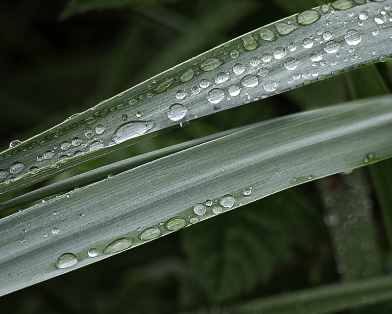
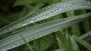
Original digital captureWhat I saw that I liked:Jewels of water drops always catch my eye. What I don't like in the picture:First, for some stupid reason, I decided I wanted to use a 16:9 aspect ratio this morning. Using my Panasonic GF1, that gave me only 9 megapixels to start with. Using a crop in camera like this is throwing away pixels I wish I had retained. Second, that tip poking in at the lower left has got to go. Why don't I see these distractions in the field? What I learned:So, I removed the pokie and reshot (still in 16:9) at left. Looking at it in Lightroom, however, I decided to crop the image to 4:5 aspect ratio. This leaves me with only a 6.8 megapixel file — good enough for use in a PDF or webpage, but not enough for a comfortably sized print. Oh, well. Live and learn. 2nd Chances: What I might try nextBesides, it's not like I'll never see a blade of grass with beads of water ever again. Maybe I'll try this again someday. |


