Every Picture Is a Compromise
Lessons from the Also-rans
Most photography websites show the photographer's very best work. Wonderful. But that's not the full story of a creative life. If we want to learn, we'd better pay attention to the images that aren't "greatest hits" and see what lessons they have to offer. Every picture is a compromise — the sum of its parts, optical, technical, visual, emotional, and even cosmic – well, maybe not cosmic, but sometimes spiritual. Success on all fronts is rare. It's ok to learn from those that are not our best.
This is a series about my also-rans, some of which I've been able to improve at bit (i.e., "best effort"), none of which I would consider my best. With each there are lessons worth sharing, so I will.
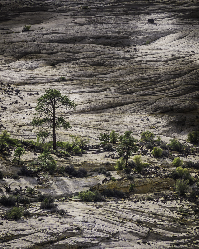
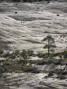
Original digital captureWhat I saw that I liked:The other day in my daily Here's a Thought… commentary, I was discussing dappled sunlight. I thought I'd demonstrate that here. What I don't like in the picture:The above is a great scene. I like the image. I like the processed version at left much better. What I learned:Dappled sunlight is easy to fake, as you can see in these two images. For reasons I've now forgotten, I also flipped the original (above) along the horizontal axis to reverse it. I guess for some reason I thought it was a stronger composition with the large tree on the left. In my eye, however, it's the fake dappled sunlight that makes this image really work. 2nd Chances: What I might try nextAgainst the white backgroun of this webpage, perhaps it needs to be just tad lighter? |


