Every Picture Is a Compromise
Lessons from the Also-rans
Most photography websites show the photographer's very best work. Wonderful. But that's not the full story of a creative life. If we want to learn, we'd better pay attention to the images that aren't "greatest hits" and see what lessons they have to offer. Every picture is a compromise — the sum of its parts, optical, technical, visual, emotional, and even cosmic – well, maybe not cosmic, but sometimes spiritual. Success on all fronts is rare. It's ok to learn from those that are not our best.
This is a series about my also-rans, some of which I've been able to improve at bit (i.e., "best effort"), none of which I would consider my best. With each there are lessons worth sharing, so I will.
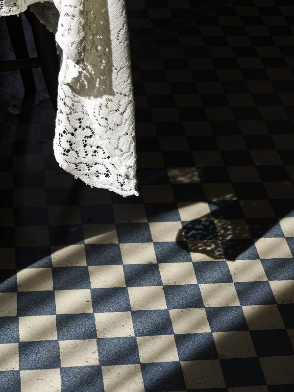
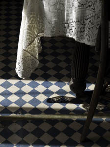
Original digital captureWhat I saw that I liked:Checkerboard floor covering in sunlight. What I don't like in the picture:Both of these have their place, but they sure are different. The one above with its horizontal and level diamonds feels more formal, more static. The one at left with its diagonals feels more dynamic and alive. Notice the light angles follow the squares in the floor covering. What I learned:Horizontals and verticals are formal, staid, static. Diagonals represent movement, life, and somehow seem more real, that is, less "constructed." 2nd Chances: What I might try nextB/W? |


