Every Picture Is a Compromise
Lessons from the Also-rans
Most photography websites show the photographer's very best work. Wonderful. But that's not the full story of a creative life. If we want to learn, we'd better pay attention to the images that aren't "greatest hits" and see what lessons they have to offer. Every picture is a compromise — the sum of its parts, optical, technical, visual, emotional, and even cosmic – well, maybe not cosmic, but sometimes spiritual. Success on all fronts is rare. It's ok to learn from those that are not our best.
This is a series about my also-rans, some of which I've been able to improve at bit (i.e., "best effort"), none of which I would consider my best. With each there are lessons worth sharing, so I will.
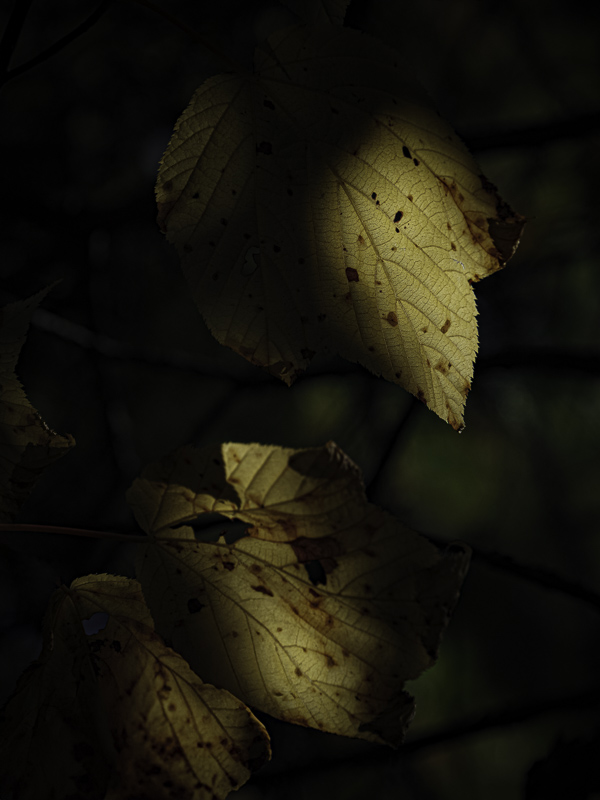
Original digital captureWhat I saw that I liked:Fall leaves are great. Fall leaves backlit are even more wonderful. What I don't like in the picture:Second day in a row I show my idiocy in simple compositions. Why did I leave that upper right corner? Dunno. Why did I cut off the backlit leaf on the bottom? Dunno. I think I was distracted by Elvis and the unicorn exiting the space ship just out of the frame. Yeah, that's it. What I learned:Light itself can be the subject, true, but it has to illuminate something or it can't be seen. In the image at left, the leaves are almost incidental. It's that glowing light that is so interesting. 2nd Chances: What I might try nextPrinting this one will be delicate. The dark background will need to have some visibility and it will be very easy for this to go too dark. Trial and error will come into play. |


