Every Picture Is a Compromise
Lessons from the Also-rans
Most photography websites show the photographer's very best work. Wonderful. But that's not the full story of a creative life. If we want to learn, we'd better pay attention to the images that aren't "greatest hits" and see what lessons they have to offer. Every picture is a compromise — the sum of its parts, optical, technical, visual, emotional, and even cosmic – well, maybe not cosmic, but sometimes spiritual. Success on all fronts is rare. It's ok to learn from those that are not our best.
This is a series about my also-rans, some of which I've been able to improve at bit (i.e., "best effort"), none of which I would consider my best. With each there are lessons worth sharing, so I will.
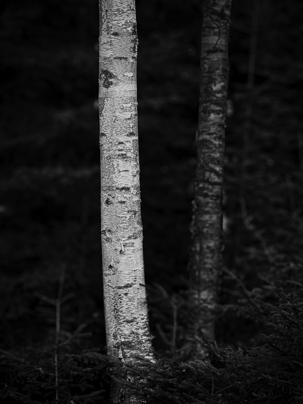
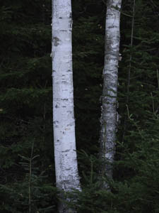
Original digital captureWhat I saw that I liked:White tree trunks. Ansel Adams already did it to perfection, but I just can't resist. What I don't like in the picture:The above is factual, but not emotional. Two trees. Big deal. What I learned:The one at left has some obvious tonal adjustments to build contrast between the two trees, but I also use the new "Lens Blur" tool in Lightroom to soften the background. Is it convincing? 2nd Chances: What I might try nextThere are two oval white areas on the right side of the darker tree. I think those need to go. They are too distracting. |


