Every Picture Is a Compromise
Lessons from the Also-rans
Most photography websites show the photographer's very best work. Wonderful. But that's not the full story of a creative life. If we want to learn, we'd better pay attention to the images that aren't "greatest hits" and see what lessons they have to offer. Every picture is a compromise — the sum of its parts, optical, technical, visual, emotional, and even cosmic – well, maybe not cosmic, but sometimes spiritual. Success on all fronts is rare. It's ok to learn from those that are not our best.
This is a series about my also-rans, some of which I've been able to improve at bit (i.e., "best effort"), none of which I would consider my best. With each there are lessons worth sharing, so I will.
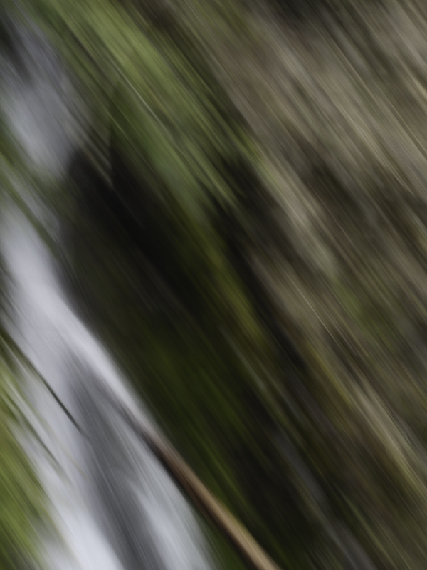
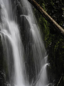
Original digital captureWhat I saw that I liked:Roadside waterfall and log. What I don't like in the picture:By all objective standards and conventions, the one above is supposed to be the better photograph. Nice lacy water and a diagonal composition. Then why do I like the one at left better? What I learned:Yes, photography is about how things appear to our eye, but it is also about how things feel to our heart. The image at left has the energy of the the falling water. It speaks to me emotionally. It won't win any accolades. So which do I produce and show? This is far more than a philosophical question. Seriously, which one rises to the level of personal expression? If I choose the one at left, will anyone else care for the picture? Do I care? Should I care? 2nd Chances: What I might try nextMaybe I need a small project based on the image at left. |


