Every Picture Is a Compromise
Lessons from the Also-rans
Most photography websites show the photographer's very best work. Wonderful. But that's not the full story of a creative life. If we want to learn, we'd better pay attention to the images that aren't "greatest hits" and see what lessons they have to offer. Every picture is a compromise — the sum of its parts, optical, technical, visual, emotional, and even cosmic – well, maybe not cosmic, but sometimes spiritual. Success on all fronts is rare. It's ok to learn from those that are not our best.
This is a series about my also-rans, some of which I've been able to improve at bit (i.e., "best effort"), none of which I would consider my best. With each there are lessons worth sharing, so I will.
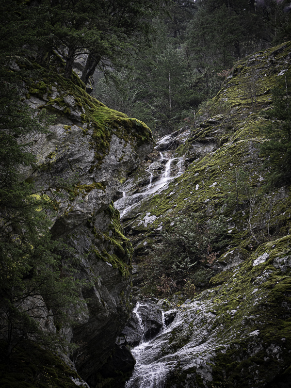
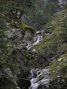
Original digital captureWhat I saw that I liked:Lovely waterfall. Not lovely powerlines. What I don't like in the picture:I know I'm not the only one who makes these kinds of photographs that have some glaring problem that is simply ignored or not seen in the field. Honestly, I never even saw the powerlines. Yikes. What I learned:Content-aware fill is amazingly good. I liked the composition enough to give it an experimental go. A straight line selection of the powerline in Lightroom and a content-aware delete and the problematic two lines are gone — like they were never there! Part of me thinks this is scary. The artist in me thinks this is a perfect salvation for some of my troubled images. 2nd Chances: What I might try nextYou may also notice that I got rid of some sky coming through the trees in the far upper right corner. |


