Every Picture Is a Compromise
Lessons from the Also-rans
Most photography websites show the photographer's very best work. Wonderful. But that's not the full story of a creative life. If we want to learn, we'd better pay attention to the images that aren't "greatest hits" and see what lessons they have to offer. Every picture is a compromise — the sum of its parts, optical, technical, visual, emotional, and even cosmic – well, maybe not cosmic, but sometimes spiritual. Success on all fronts is rare. It's ok to learn from those that are not our best.
This is a series about my also-rans, some of which I've been able to improve at bit (i.e., "best effort"), none of which I would consider my best. With each there are lessons worth sharing, so I will.
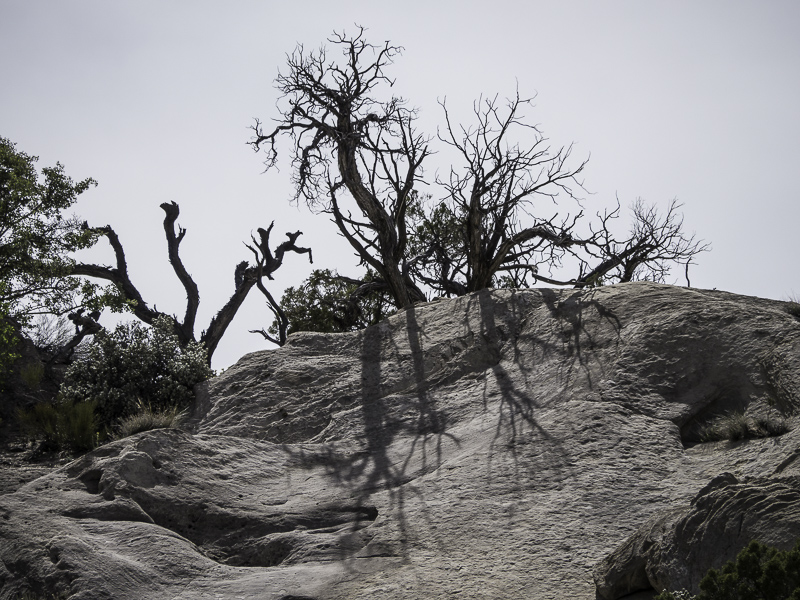
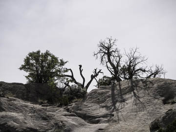
Original digital captureWhat I saw that I liked:The balance of the live tree on the left and the dead trees on the right. What I don't like in the picture:In the shot above, all that empty sky is bothersome. What I learned:I quickly recomposed and shot the image at left. I reduced the sky problem but cropped out most of the live tree on the left, losing any sense of balance. These two attempts are both losers for different reasons. 2nd Chances: What I might try nextThen again, a simple solution I want to try is to just crop off the top of the above image to the bare minimum of sky. That would preserve the balance. I might be able to punch up the blue in the sky. Or b/w? I also should try cropping off the bottom a bit to turn the entire image into a pano. Not done with this one yet, but clearly neither the above nor the left are acceptable. |


