Every Picture Is a Compromise
Lessons from the Also-rans
Most photography websites show the photographer's very best work. Wonderful. But that's not the full story of a creative life. If we want to learn, we'd better pay attention to the images that aren't "greatest hits" and see what lessons they have to offer. Every picture is a compromise — the sum of its parts, optical, technical, visual, emotional, and even cosmic – well, maybe not cosmic, but sometimes spiritual. Success on all fronts is rare. It's ok to learn from those that are not our best.
This is a series about my also-rans, some of which I've been able to improve at bit (i.e., "best effort"), none of which I would consider my best. With each there are lessons worth sharing, so I will.
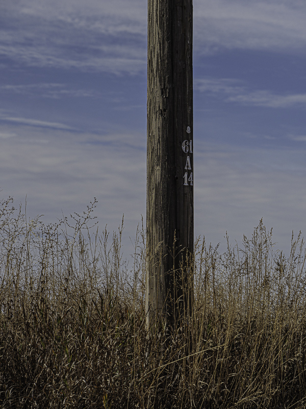
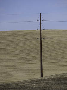
Original digital captureIndecision WeekWhich image is better? This is the question that plagues all of us when making a selection from the thousands of images we've captured. This week, let's get right to it. Here are pairs of images that I simply cannot decide on. Your thoughts? What I saw that I liked in the above:There is a "sentinel" quality to the full pole above that I like, particularly in relation to the horizontal lines in the field. I do wish that there wasn't a merge between the middle supports and the horizon line. I can probably fix that with a little Photoshop work. What I saw that I liked at left:In the version at left, the details come out more clearly, particularly the texture on the pole and the grasses in front. What I learned:Maybe these two go together in a trilogy or a Seeing in SIXES type of project? As long as I was out there in the middle of wheat country,why not capture both versions in case this grows into a multiple-image project? (Are you sensing a theme here?) 2nd Chances: What I might try nextSearch for other images in my Lightroom catalog that might allow this to grow into a small project. |


