Every Picture Is a Compromise
Lessons from the Also-rans
Most photography websites show the photographer's very best work. Wonderful. But that's not the full story of a creative life. If we want to learn, we'd better pay attention to the images that aren't "greatest hits" and see what lessons they have to offer. Every picture is a compromise — the sum of its parts, optical, technical, visual, emotional, and even cosmic – well, maybe not cosmic, but sometimes spiritual. Success on all fronts is rare. It's ok to learn from those that are not our best.
This is a series about my also-rans, some of which I've been able to improve at bit (i.e., "best effort"), none of which I would consider my best. With each there are lessons worth sharing, so I will.
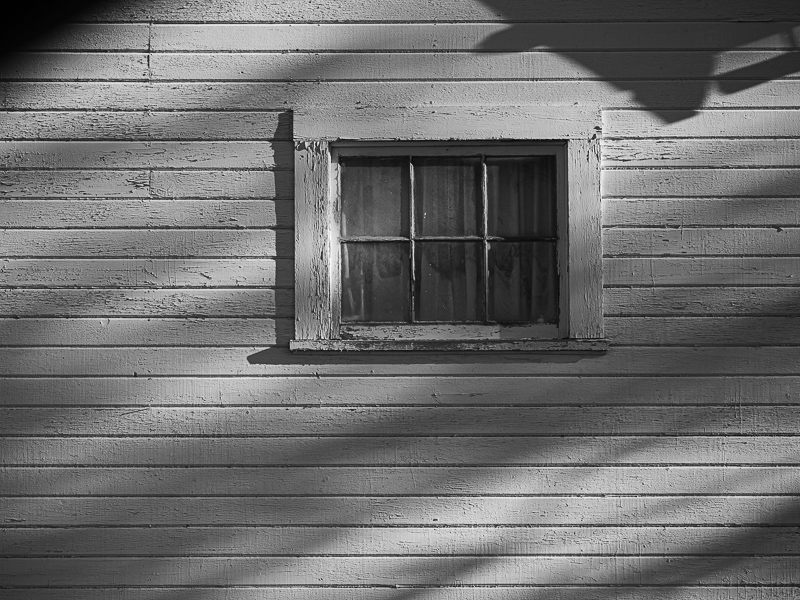
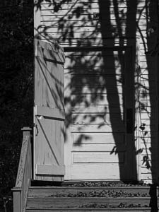
Original digital captureIndecision WeekWhich image is better? This is the question that plagues all of us when making a selection from the thousands of images we've captured. This week, let's get right to it. Here are pairs of images that I simply cannot decide on. Your thoughts? What I saw that I liked in the above:The shadow of the tree is what caught my eye. Unfortunately, the left edge of the image was empty. I tried to open the door and was delighted that it wasn't locked. The door and tree balance each other as do the handrail and that branch on the far right edge. What I saw that I liked at left:The shadows on the wall at left are less distinct than those in the above, but I like that there are less demanding. The shadows add a sense of light, but the subject is still the window and the wall. What I learned:This was a lovely winter day with soft, low angled light. Perfect for both of these kinds of images. Once I had seen them and made the two images on this page, I kept my eye out for other white buildings that might allow this to develop into a small project. As long as you are in the field photographing, why not search of other scenes that will combine with those you've already photographed? [Theme redux] 2nd Chances: What I might try nextHere again, these white need to be perfect. I need to fuss with them a bit and make adjustments so that the white walls are tweaked based on the background color of the project and medium of their final use. |


