Every Picture Is a Compromise
Lessons from the Also-rans
Most photography websites show the photographer's very best work. Wonderful. But that's not the full story of a creative life. If we want to learn, we'd better pay attention to the images that aren't "greatest hits" and see what lessons they have to offer. Every picture is a compromise — the sum of its parts, optical, technical, visual, emotional, and even cosmic – well, maybe not cosmic, but sometimes spiritual. Success on all fronts is rare. It's ok to learn from those that are not our best.
This is a series about my also-rans, some of which I've been able to improve at bit (i.e., "best effort"), none of which I would consider my best. With each there are lessons worth sharing, so I will.
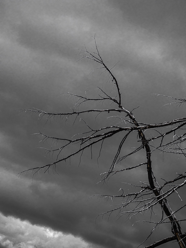
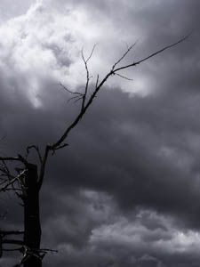
Original digital captureSky WeekSo many times the success of a landscape is actually a function of the sky. It would be odd to call them "skyscapes," but we can think of them that way and very probably improve our photographs. This week, we'll look at sky failures. What I saw that I liked:I love to explore the relationships and contrast of objects rooted in tierra firma to the roiling clouds overhead. Often this involves bare trees. What I don't like in the picture:In the above image, I remember carefully lining up the main tree trunk in the lower left to be parallel with the edge of the frame. Now that I see the image here, I think that rectilinearity doesn't help the photograph — in fact, it makes the diagonal branch seem wrong. What I learned:Compare the above to the Dutch angle used in the image at left. That line between the dark and bright cloud in the lower left is the horizon line, but by composing this to an angle, it make the leaning tree fill the frame. Rectifying the horizon is not always the answer that magnifies the emotion. 2nd Chances: What I might try nextWith a little work, I can smooth out some of that blotchiness in the sky. |


