Every Picture Is a Compromise
Lessons from the Also-rans
Most photography websites show the photographer's very best work. Wonderful. But that's not the full story of a creative life. If we want to learn, we'd better pay attention to the images that aren't "greatest hits" and see what lessons they have to offer. Every picture is a compromise — the sum of its parts, optical, technical, visual, emotional, and even cosmic – well, maybe not cosmic, but sometimes spiritual. Success on all fronts is rare. It's ok to learn from those that are not our best.
This is a series about my also-rans, some of which I've been able to improve at bit (i.e., "best effort"), none of which I would consider my best. With each there are lessons worth sharing, so I will.
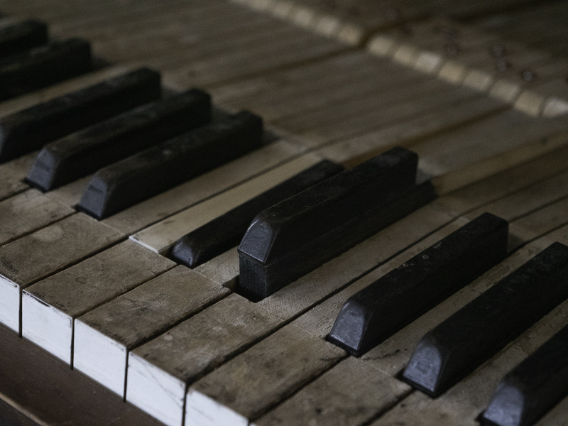
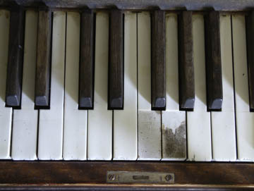
Original digital captureWhat I saw that I liked:Piano parts and craftsmanship is fine, but where the instrument and the human make contact is in the keys. What I don't like in the picture:I was captivated by the damaged G key in the above. Same piano as I was discussing yesterday. I pointed the camera downward to make this image and it has always felt odd to me. We don't look straight down at a piano. We naturally look at an angle when we sit to play. What I learned:The image at left was photographed 16 years after the above. Different location, but same idea. The damage is more extreme, but that seems to indicated more use — a good thing for a musical instrument. I particularly like the raised D# key — which is exactly how I found it. Along with the C# key being depressed, it almost bring forth music in this still photograph. 2nd Chances: What I might try nextWho says you can't get a shallow depth of field with a m4/3 camera? |


