Every Picture Is a Compromise
Lessons from the Also-rans
Most photography websites show the photographer's very best work. Wonderful. But that's not the full story of a creative life. If we want to learn, we'd better pay attention to the images that aren't "greatest hits" and see what lessons they have to offer. Every picture is a compromise — the sum of its parts, optical, technical, visual, emotional, and even cosmic – well, maybe not cosmic, but sometimes spiritual. Success on all fronts is rare. It's ok to learn from those that are not our best.
This is a series about my also-rans, some of which I've been able to improve at bit (i.e., "best effort"), none of which I would consider my best. With each there are lessons worth sharing, so I will.
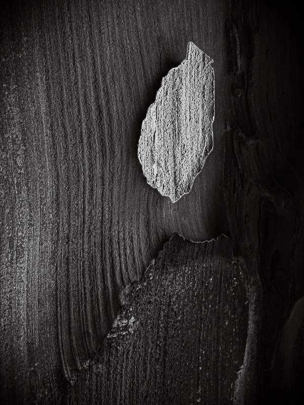
Original digital captureWhat I saw that I liked:Shapes and lines are often more important that what the subject is — particularly for semi-abstractions like this one. What I don't like in the picture:The color and the lack of contrast are the two elements that need most critical attention. What I learned:After I had completed the tonal adjustments, I rotated the image just to see what might become visible. I do this with some regularity with abstracts. You never know. Rotating this image 180° revealed an unexpected flame above a candle. I had no idea of any of this — the tonal possibilities nor the metaphorical ones — when I captured the image above. Just listen to your instinct and if it captures your attention, photograph it. Maybe the hidden possibilities will emerge later. I found this image 14 years after I photographed it. 2nd Chances: What I might try nextI'm excited to see how this looks in a small print — mayber 4x5" or 5x7". I don't think it needs to be any larger than that. |


