Every Picture Is a Compromise
Lessons from the Also-rans
Most photography websites show the photographer's very best work. Wonderful. But that's not the full story of a creative life. If we want to learn, we'd better pay attention to the images that aren't "greatest hits" and see what lessons they have to offer. Every picture is a compromise — the sum of its parts, optical, technical, visual, emotional, and even cosmic – well, maybe not cosmic, but sometimes spiritual. Success on all fronts is rare. It's ok to learn from those that are not our best.
This is a series about my also-rans, some of which I've been able to improve at bit (i.e., "best effort"), none of which I would consider my best. With each there are lessons worth sharing, so I will.

Previous image | Next image |
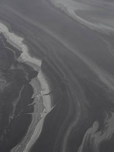
Original digital capture

High Contrast Week
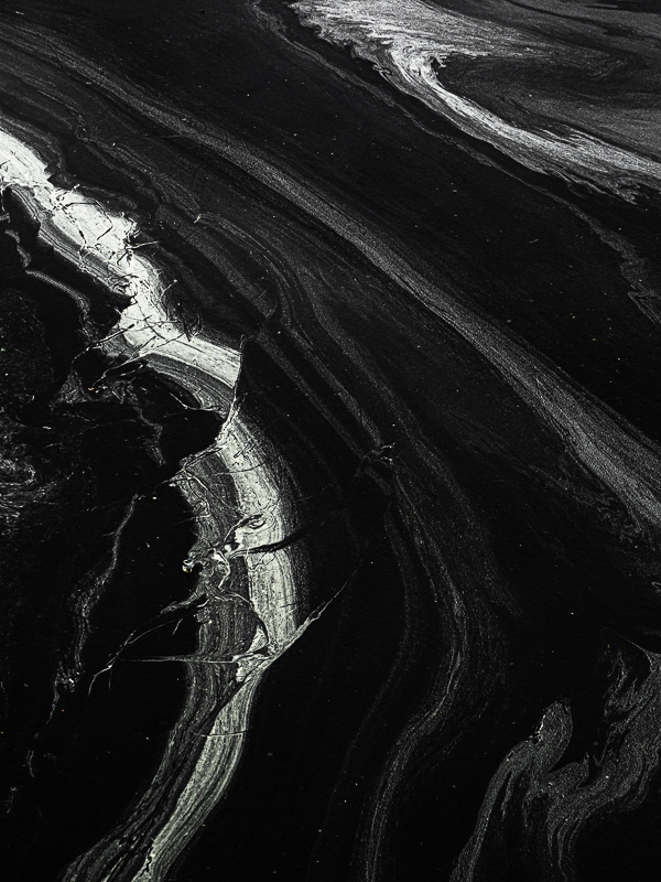
Sometimes the light is just flat and downright discouraging. Fortunately, we need not accept that flat contrast as is. Pushing the contrast of an image to extremes can often salvage what looks like a weak image into a strong one. This week is an exploration of turning low contrast failures into high contrast successes.
What I saw that I liked:
Swoopy lines of pollen in a puddle in the parking lot.
What I don't like in the picture:
A photograph is made of shapes and tones. In the above, the tone suck by the shapes are interesting.
What I learned:
More and more I find in the field I'm more likely to photograph based on shapes rather than tones. Shapes and lines are hard to adjust in processing; tones on the other hand can be pushed and pushed and pushed. I snapped the above with this in mind. I had no idea if the processed image would be interesting, but I knew the shapes were. Sometimes you just have to have a little faith. |
|


