Every Picture Is a Compromise
Lessons from the Also-rans
Most photography websites show the photographer's very best work. Wonderful. But that's not the full story of a creative life. If we want to learn, we'd better pay attention to the images that aren't "greatest hits" and see what lessons they have to offer. Every picture is a compromise — the sum of its parts, optical, technical, visual, emotional, and even cosmic – well, maybe not cosmic, but sometimes spiritual. Success on all fronts is rare. It's ok to learn from those that are not our best.
This is a series about my also-rans, some of which I've been able to improve at bit (i.e., "best effort"), none of which I would consider my best. With each there are lessons worth sharing, so I will.
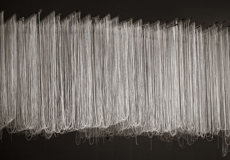
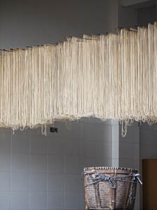
Original digital captureWhat I saw that I liked:These noodles hung out to dry were fascinating. You don't see this in America! Click. What I don't like in the picture:Static, descriptive, factual, a bit boring. What I learned:Sometimes, I feel pulled in two completely different directions by a subject. In the above image, I wanted to show what and where. But as artwork, I just don't think it works. Documentary, maybe, but fine art? Questionable. So, I also made the image at left — where the subject has more to do with graphic design than it does with Chinese culture. I like the one on the left better as artwork, but I prefer the one above as part of a story about rural China. Photographs have a purpose. I guess it's important that we understand what that purpose is and allow that to influence our subsequent decisions about processing and how the image will be used. Maybe this is obvious. 2nd Chances: What I might try nextI suspect the question about art or not might be answered if I made a print and looked at it on the wall. Hmmm . . . presentation defines interpretation? Boy, does that seem like a shaky proposition! |


