Every Picture Is a Compromise
Lessons from the Also-rans
Most photography websites show the photographer's very best work. Wonderful. But that's not the full story of a creative life. If we want to learn, we'd better pay attention to the images that aren't "greatest hits" and see what lessons they have to offer. Every picture is a compromise — the sum of its parts, optical, technical, visual, emotional, and even cosmic – well, maybe not cosmic, but sometimes spiritual. Success on all fronts is rare. It's ok to learn from those that are not our best.
This is a series about my also-rans, some of which I've been able to improve at bit (i.e., "best effort"), none of which I would consider my best. With each there are lessons worth sharing, so I will.
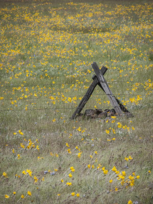
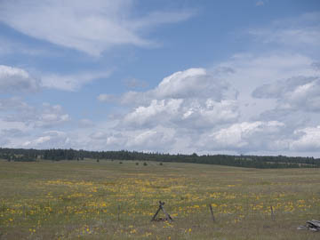
Original digital captureWhat I saw that I liked:A beautiful, but windy day. Where is Julie Andrews when you need her? The hills are alive . . . What I don't like in the picture:What I really wanted to photograph was the warm, summer wind. The grand landscape composition above does nothing to tell you it was windy. So, I re-composed to capture the wind-blown flowers — and then (bonehead mistake alert!) eliminated any movement by using a fast shutter speed. Bent flowers are not the same as wind-blown flowers. What I learned:Wind is one of the hardest thing there is to photograph. First, it's invisible, so you can only try to photograph the effect of the wind, not the wind itself. Second, blurry things often just look like blurred things, not wind. Also, blowing wind moves the camera, even if it's on a solid tripod. The camera movement makes non-moving things blurry. 2nd Chances: What I might try nextThere's got to be a way to do this successfully, I just don't know it. Yet. |


