Every Picture Is a Compromise
Lessons from the Also-rans
Most photography websites show the photographer's very best work. Wonderful. But that's not the full story of a creative life. If we want to learn, we'd better pay attention to the images that aren't "greatest hits" and see what lessons they have to offer. Every picture is a compromise — the sum of its parts, optical, technical, visual, emotional, and even cosmic – well, maybe not cosmic, but sometimes spiritual. Success on all fronts is rare. It's ok to learn from those that are not our best.
This is a series about my also-rans, some of which I've been able to improve at bit (i.e., "best effort"), none of which I would consider my best. With each there are lessons worth sharing, so I will.
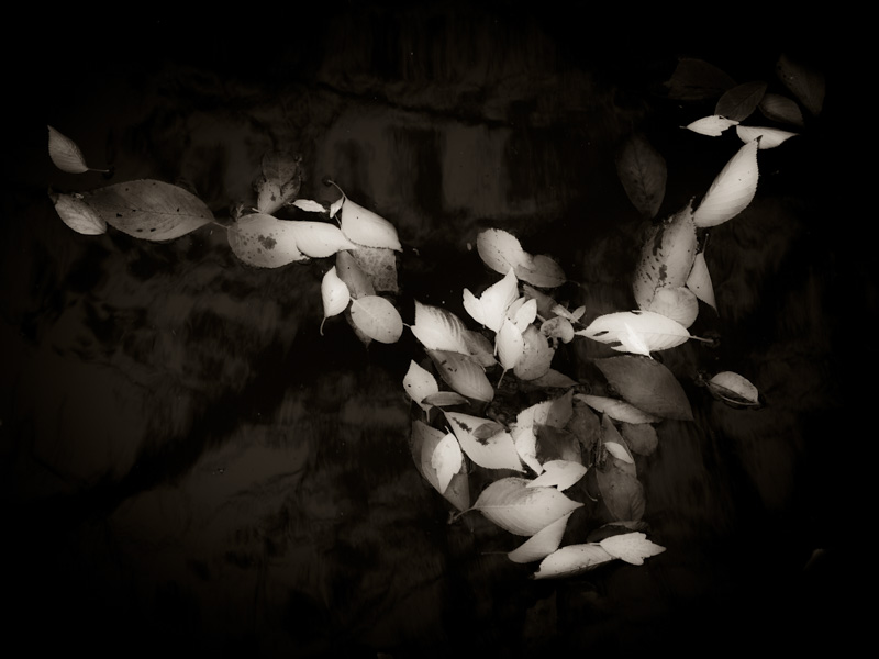
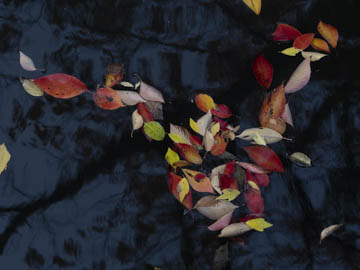
Original digital captureWhat I saw that I liked:I was captivated byt these floating leaves and the variety of colors. What I don't like in the picture:I can't put my finger on it, but there is something about this that just doesn't seem to work like I think it should. I'd given up on this one until I started working on my book, Dreams of Japan. The one at left is a heavily processed version that didn't make it into the book. What I learned:I know that some images just haunt me until I find out how they want to be. This one keeps nudging me, but neither the color version nor the dreamy b/w are yet satisfactory. More time for simmering, I guess. The answer will come, but in its own time. 2nd Chances: What I might try nextI want to try blending this image with something. Maybe that'll lead somewhere interesting. |


