Every Picture Is a Compromise
Lessons from the Also-rans
Most photography websites show the photographer's very best work. Wonderful. But that's not the full story of a creative life. If we want to learn, we'd better pay attention to the images that aren't "greatest hits" and see what lessons they have to offer. Every picture is a compromise — the sum of its parts, optical, technical, visual, emotional, and even cosmic – well, maybe not cosmic, but sometimes spiritual. Success on all fronts is rare. It's ok to learn from those that are not our best.
This is a series about my also-rans, some of which I've been able to improve at bit (i.e., "best effort"), none of which I would consider my best. With each there are lessons worth sharing, so I will.
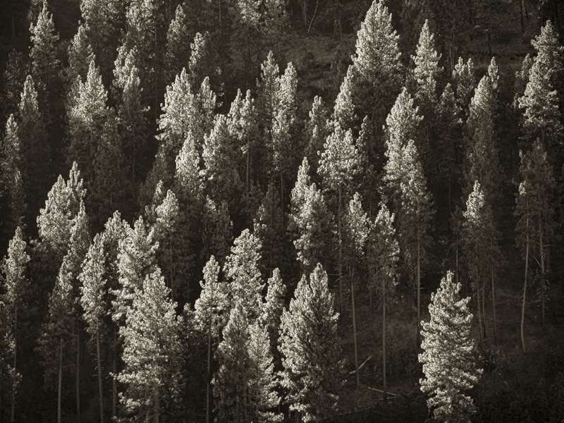
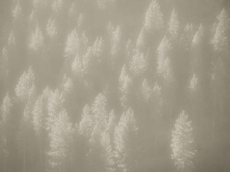
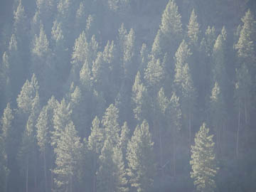
Original digital captureWhat I saw that I liked:Lovely sunlight, lovely trees. What I don't like in the picture:Yucky, smoky air. What I learned:I always tend to want to push these kinds of images so they look "normal" that is, with clean air. Now with the "Dehaze" slide, we can really push things, like at left/top. I've found, however, that they never quite look right. Something phony about them. However, if we go in the other direction like at left/bottom, there are times when it works. Not this one, but it's a good example of the concept. 2nd Chances: What I might try nextNot crazy about the tone in the one below. Neutral gray? |


