Every Picture Is a Compromise
Lessons from the Also-rans
Most photography websites show the photographer's very best work. Wonderful. But that's not the full story of a creative life. If we want to learn, we'd better pay attention to the images that aren't "greatest hits" and see what lessons they have to offer. Every picture is a compromise — the sum of its parts, optical, technical, visual, emotional, and even cosmic – well, maybe not cosmic, but sometimes spiritual. Success on all fronts is rare. It's ok to learn from those that are not our best.
This is a series about my also-rans, some of which I've been able to improve at bit (i.e., "best effort"), none of which I would consider my best. With each there are lessons worth sharing, so I will.
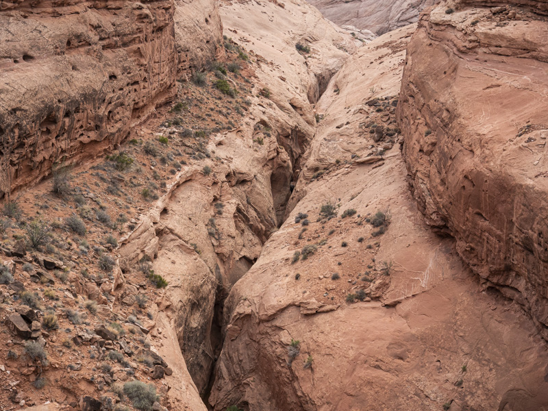
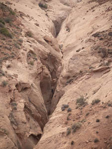
Original digital captureWhat I saw that I liked:This crevice in the rocks near Mt. Hillers was scary to peer down into. I'm squeamish about heights and I wanted that to come through in the photograph. What I don't like in the picture:The above shows the crevice, but doesn't really show the depth. I tried several angles and compositions, but it just didn't feel as menacing as it was. What I learned:The problem was that I used a vertical orientation, trying to get in the length of the crevice. That eliminated the walls to left and right. Simply turning the orientation to a horizontal composition brought the walls back into view and made the depth feel deeper. 2nd Chances: What I might try nextI can't decide whether this should be color or b/w. Time to play around with that. |


