Every Picture Is a Compromise
Lessons from the Also-rans
Most photography websites show the photographer's very best work. Wonderful. But that's not the full story of a creative life. If we want to learn, we'd better pay attention to the images that aren't "greatest hits" and see what lessons they have to offer. Every picture is a compromise — the sum of its parts, optical, technical, visual, emotional, and even cosmic – well, maybe not cosmic, but sometimes spiritual. Success on all fronts is rare. It's ok to learn from those that are not our best.
This is a series about my also-rans, some of which I've been able to improve at bit (i.e., "best effort"), none of which I would consider my best. With each there are lessons worth sharing, so I will.
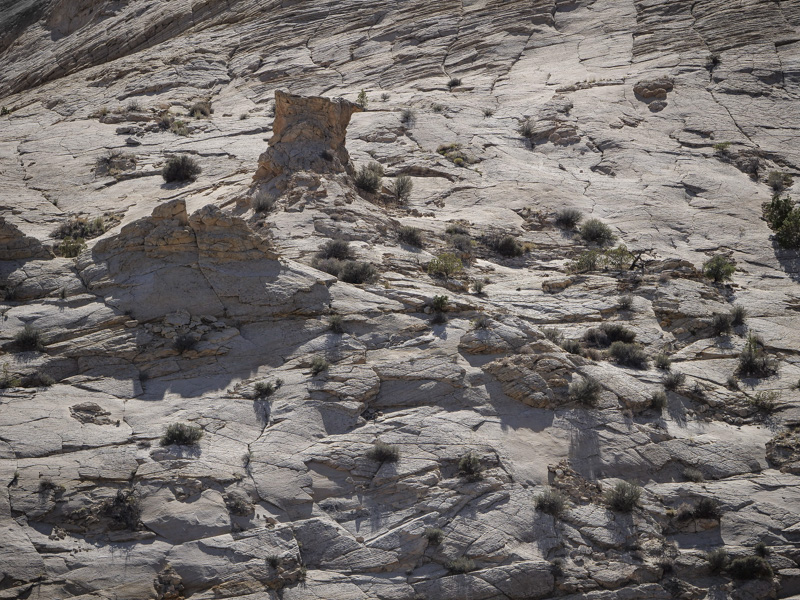
Original digital captureWhat I saw that I liked:The Utah desert rocks never fail to entice me. What I don't like in the picture:You can barely see in the very upper left corner of the above image, a bit of blue sky that crept into this image. Damn. Easy to fix with a little cloning, but why did I have to? What I learned:The image we see in the camera (viewfinder in particular) is so small that tiny corners like this are easy to miss. Even reviewing this right after the exposure when looking at the larger LCD screen, I still missed that damn corner blue. Check the corners. Check the corners. Check the corners. Then, for good measure, check them one more time. Or get really good at post-processing fixes. 2nd Chances: What I might try nextIf cloning doesn't work, there's always cropping, but sometimes that has consequenses in other areas of the image that we'd just as soon avoid. |


