Every Picture Is a Compromise
Lessons from the Also-rans
Most photography websites show the photographer's very best work. Wonderful. But that's not the full story of a creative life. If we want to learn, we'd better pay attention to the images that aren't "greatest hits" and see what lessons they have to offer. Every picture is a compromise — the sum of its parts, optical, technical, visual, emotional, and even cosmic – well, maybe not cosmic, but sometimes spiritual. Success on all fronts is rare. It's ok to learn from those that are not our best.
This is a series about my also-rans, some of which I've been able to improve at bit (i.e., "best effort"), none of which I would consider my best. With each there are lessons worth sharing, so I will.
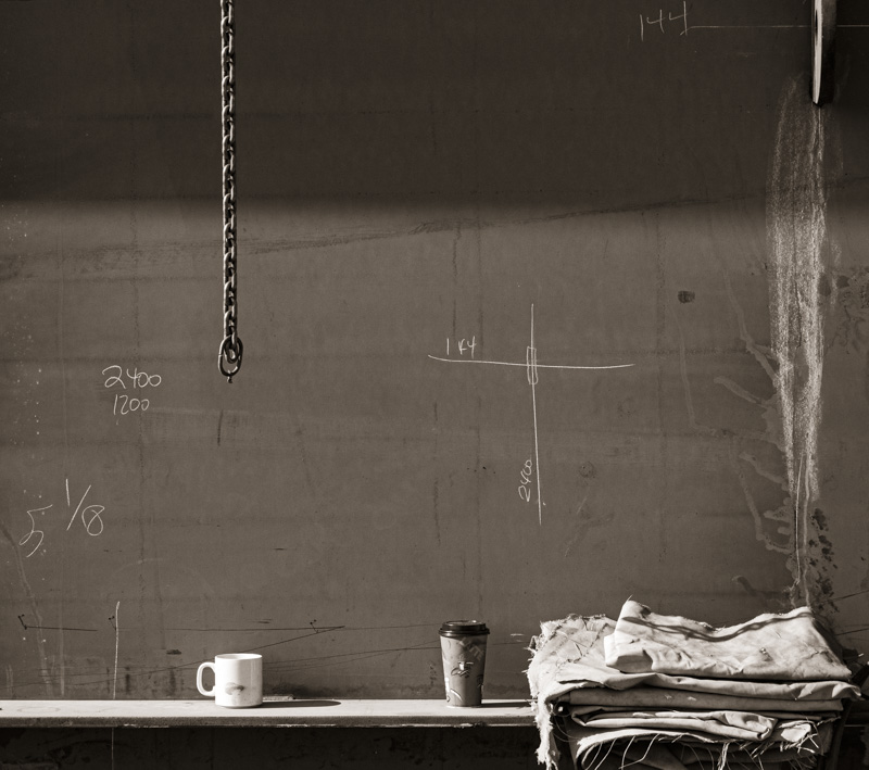
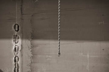
Original digital captureThis week, I'm going through some of the images from the Dakota Creek shipyard project. What I saw that I liked:The hanging chain is what first caught my eye. What I don't like in the picture:The three main elements have no connection to one another — the graphic to the left, the chain, and the chalk marks. What I learned:Also missing from the above is the human element. By zooming out just a bit and including the coffee cups, a human element ties the rest of the graphics in the image together. At least it does in my mind. 2nd Chances: What I might try nextNow that I'm looking at this here on the web page, I'm thinking it could use just a bit more contrast. |


