Every Picture Is a Compromise
Lessons from the Also-rans
Most photography websites show the photographer's very best work. Wonderful. But that's not the full story of a creative life. If we want to learn, we'd better pay attention to the images that aren't "greatest hits" and see what lessons they have to offer. Every picture is a compromise — the sum of its parts, optical, technical, visual, emotional, and even cosmic – well, maybe not cosmic, but sometimes spiritual. Success on all fronts is rare. It's ok to learn from those that are not our best.
This is a series about my also-rans, some of which I've been able to improve at bit (i.e., "best effort"), none of which I would consider my best. With each there are lessons worth sharing, so I will.
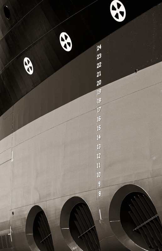
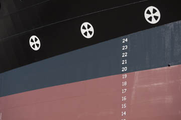
Original digital captureWhat I saw that I liked:Fun graphics on the side of the hull that are easily composed into Mondrian-like images. What I don't like in the picture:Perhaps it's not a question of "don't like" because I do like the one above. It's just that I like the one at left even more. What I learned:Most compositions have a dominant element. I'm not talking about the "subject" versus the background, but rather something in the picture that is the element that directs our eye movement through the image. In this case, it's the depth guage numbers on the hull. Because of that visual dominance, I think this works better as a portrait orientation image. 2nd Chances: What I might try nextIt would be an interesting (but intellectual) experiment to clone out the number in Photoshop just to see how that changes the compositional preference. |


