Every Picture Is a Compromise
Lessons from the Also-rans
Most photography websites show the photographer's very best work. Wonderful. But that's not the full story of a creative life. If we want to learn, we'd better pay attention to the images that aren't "greatest hits" and see what lessons they have to offer. Every picture is a compromise — the sum of its parts, optical, technical, visual, emotional, and even cosmic – well, maybe not cosmic, but sometimes spiritual. Success on all fronts is rare. It's ok to learn from those that are not our best.
This is a series about my also-rans, some of which I've been able to improve at bit (i.e., "best effort"), none of which I would consider my best. With each there are lessons worth sharing, so I will.
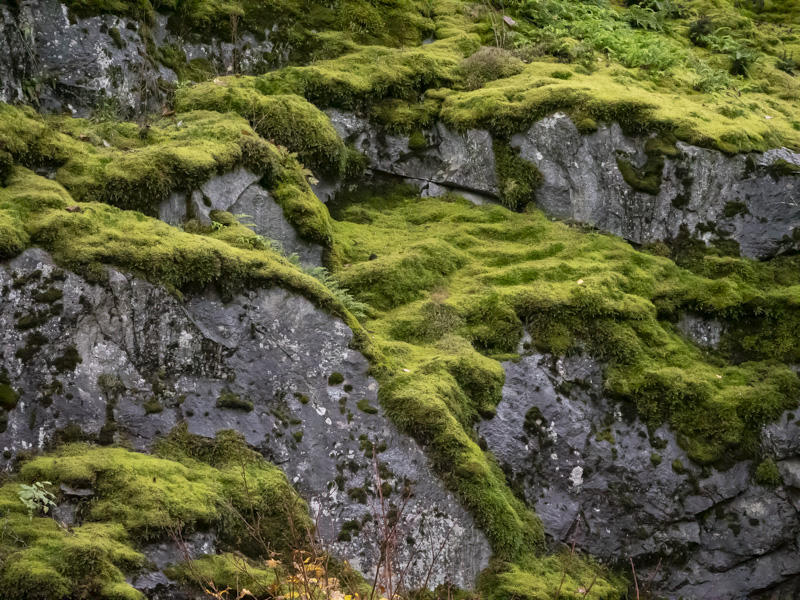
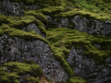
Original digital captureWhat I saw that I liked:Moss . . . What I don't like in the picture:. . . is difficult to photograph. It's all about the texture, but it's also about the coverage. To show texture, you need to be close. To show coverage, you need to be far enough away. What I learned:I guess I haven't learned whatever it is I need to learn. This one is close to showing both texture and coverage, but I wish the texture came through more. The other tricky thing about moss is that it feels green, but look at how much yellow there is in there after I increased the exposure in Lightroom just it a bit! 2nd Chances: What I might try nextAngular light shows more texture than flat light. Maybe I need some filtered sunlight, just enough to enhance the detail? |


