Every Picture Is a Compromise
Lessons from the Also-rans
Most photography websites show the photographer's very best work. Wonderful. But that's not the full story of a creative life. If we want to learn, we'd better pay attention to the images that aren't "greatest hits" and see what lessons they have to offer. Every picture is a compromise — the sum of its parts, optical, technical, visual, emotional, and even cosmic – well, maybe not cosmic, but sometimes spiritual. Success on all fronts is rare. It's ok to learn from those that are not our best.
This is a series about my also-rans, some of which I've been able to improve at bit (i.e., "best effort"), none of which I would consider my best. With each there are lessons worth sharing, so I will.
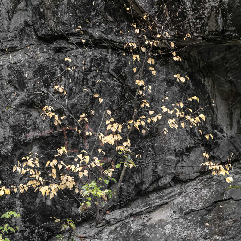
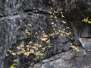
Original digital captureWhat I saw that I liked:I guess ideas just circle around and repeat themselves every 360°. I realized that I'd addressed this image idea some time ago. Round and round we go. What I don't like in the picture:I should use this as the quintessential example of some bad boy poking in from the edge of the image. Do I really need that branch on the right? What I learned:And by cropping this to a square I got rid of the branch poking in on the right, but that created a light colored rock triangle on the right. Compare the two images and you'll see what I had to fix as a consequence of fixing the first mistake. Sometimes, the "begats" are endless. Got lucky on this one. 2nd Chances: What I might try nextI shot this at f/3.4. Wish I had a bit more depth of field because some of the yellow leaves could be sharper. |


