Every Picture Is a Compromise
Lessons from the Also-rans
Most photography websites show the photographer's very best work. Wonderful. But that's not the full story of a creative life. If we want to learn, we'd better pay attention to the images that aren't "greatest hits" and see what lessons they have to offer. Every picture is a compromise — the sum of its parts, optical, technical, visual, emotional, and even cosmic – well, maybe not cosmic, but sometimes spiritual. Success on all fronts is rare. It's ok to learn from those that are not our best.
This is a series about my also-rans, some of which I've been able to improve at bit (i.e., "best effort"), none of which I would consider my best. With each there are lessons worth sharing, so I will.
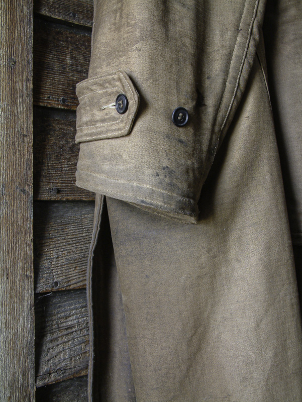
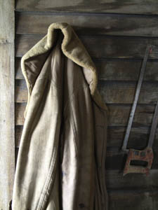
Original digital captureWhat I saw that I liked:In nostalgic places like this (e.g., this museum in North Dakota), I look for the human touch. Coats are a common subject for me. What I don't like in the picture:In the one above, the object is there, but it doesn't strick me as "the strongest way of seeing." I can feel Edward Weston wagging his finger at me from that Great Darkroom in the sky. What I learned:The one at left is much more satisfying to me. Interestingly enough, the colors you see are faithful to the object, but the camera's Auto White Balance wasn't even close. I guess it wanted to see some blue which simply isn't there. Like yesterday's example, this one requires human intervention and an override to make it look right. 2nd Chances: What I might try nextI'm pretty happy with this one. |


