Every Picture Is a Compromise
Lessons from the Also-rans
Most photography websites show the photographer's very best work. Wonderful. But that's not the full story of a creative life. If we want to learn, we'd better pay attention to the images that aren't "greatest hits" and see what lessons they have to offer. Every picture is a compromise — the sum of its parts, optical, technical, visual, emotional, and even cosmic – well, maybe not cosmic, but sometimes spiritual. Success on all fronts is rare. It's ok to learn from those that are not our best.
This is a series about my also-rans, some of which I've been able to improve at bit (i.e., "best effort"), none of which I would consider my best. With each there are lessons worth sharing, so I will.
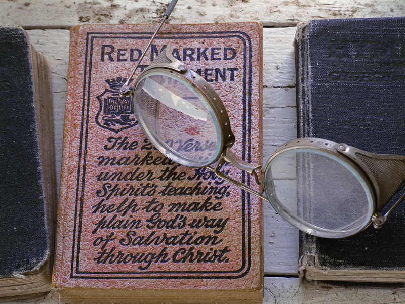
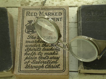
Original digital captureWhat I saw that I liked:I loved this still life the minute I saw it. I wish I had seen the White Balance control on my camera. What I don't like in the picture:This was photographed in September of 2003 with my first digital camera. I'll bet a number of you can relate when I confess that I didn't read the entire instruction manual before taking it out for use. I'll bet some of you can relate when I confess that I didn't read any of the instruction manual. White Balance? Who needs to know about White Balance? I'm a b/w photographer! What I learned:Except that when I started looking at the color images my new digital camera was recording, I had to admit that sometimes I preferred the color version before I converted it to b/w. Who needs to know about White Balance? Me, that's who. 2nd Chances: What I might try nextThankfully, I shot this in RAW so I could tweak the color balance easily. I still see a little too much green in the painted boards in the background, especially at the top of the image. |


