Every Picture Is a Compromise
Lessons from the Also-rans
Most photography websites show the photographer's very best work. Wonderful. But that's not the full story of a creative life. If we want to learn, we'd better pay attention to the images that aren't "greatest hits" and see what lessons they have to offer. Every picture is a compromise — the sum of its parts, optical, technical, visual, emotional, and even cosmic – well, maybe not cosmic, but sometimes spiritual. Success on all fronts is rare. It's ok to learn from those that are not our best.
This is a series about my also-rans, some of which I've been able to improve at bit (i.e., "best effort"), none of which I would consider my best. With each there are lessons worth sharing, so I will.
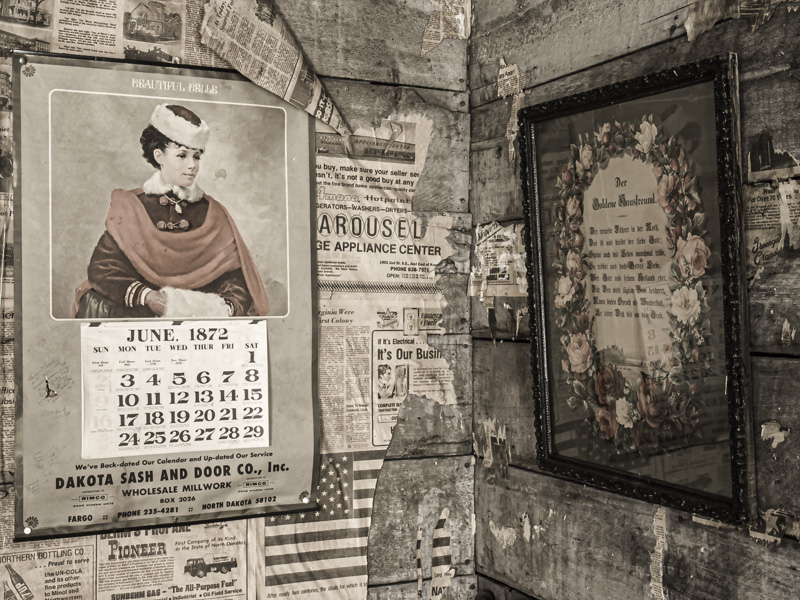
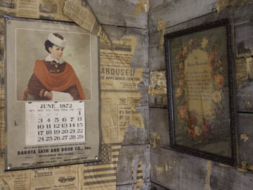
Original digital captureWhat I saw that I liked:Nostalgia on parade. What I don't like in the picture:It's not that I don't like the way the camera recorded it in the original above — it just doesn't feel as old as it should. The objects look old, but my photograph of it doesn't. What I learned:This was the first image (I shot this in 2004) that really gave me a sense of what I could do with fake color. Most of the time, color gets intensified. In this case, I reduced the saturation and that dramatically improved the image. 2nd Chances: What I might try nextI've printed this large (17x22", which is large for me) and it's fun to be able to read the text in the newspapers and the hand-written notes on the calendar. |


