Every Picture Is a Compromise
Lessons from the Also-rans
Most photography websites show the photographer's very best work. Wonderful. But that's not the full story of a creative life. If we want to learn, we'd better pay attention to the images that aren't "greatest hits" and see what lessons they have to offer. Every picture is a compromise — the sum of its parts, optical, technical, visual, emotional, and even cosmic – well, maybe not cosmic, but sometimes spiritual. Success on all fronts is rare. It's ok to learn from those that are not our best.
This is a series about my also-rans, some of which I've been able to improve at bit (i.e., "best effort"), none of which I would consider my best. With each there are lessons worth sharing, so I will.
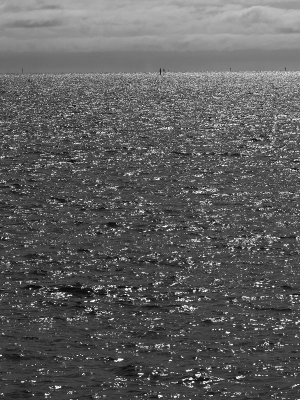
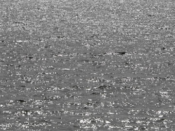
Original digital captureWhat I saw that I liked:I have no explanation, but I'm strongly drawn to this type of rough water on a windy day. I guess I just love the chaos and the strongly contrasting tones. What I don't like in the picture:The one above lacks depth. The landscape orientation gives it width, but the one at left feels larger. What I learned:Typically when I work with this subject, I want something larger in the image — a rock in the foreground, or a ship out there. This one has neither, but those very small and distant pilings add detail that enhances the scale of the scene. I do like that. 2nd Chances: What I might try nextI wonder if I could do something with those clouds to liven them up a bit? |


