Every Picture Is a Compromise
Lessons from the Also-rans
Most photography websites show the photographer's very best work. Wonderful. But that's not the full story of a creative life. If we want to learn, we'd better pay attention to the images that aren't "greatest hits" and see what lessons they have to offer. Every picture is a compromise — the sum of its parts, optical, technical, visual, emotional, and even cosmic – well, maybe not cosmic, but sometimes spiritual. Success on all fronts is rare. It's ok to learn from those that are not our best.
This is a series about my also-rans, some of which I've been able to improve at bit (i.e., "best effort"), none of which I would consider my best. With each there are lessons worth sharing, so I will.
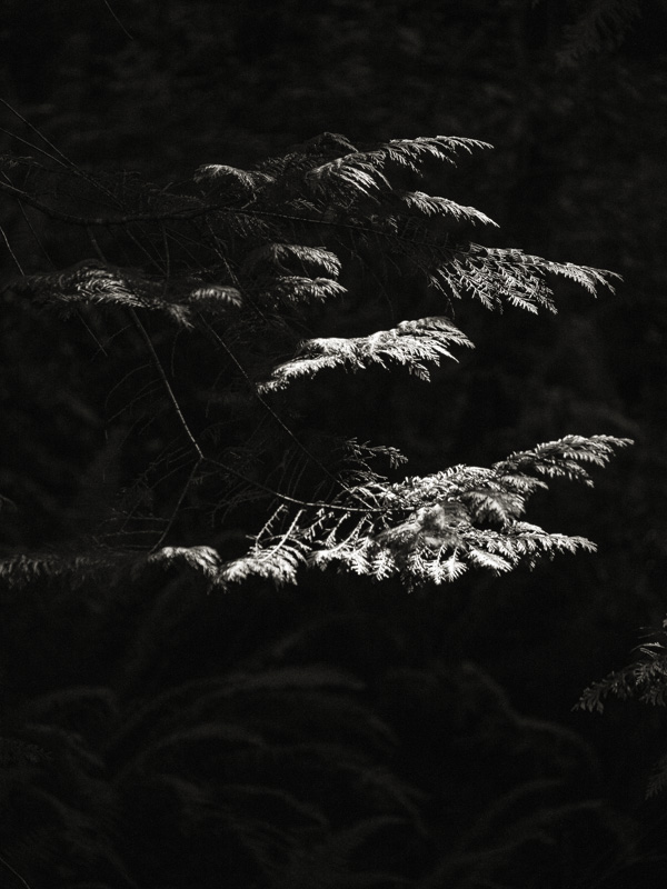
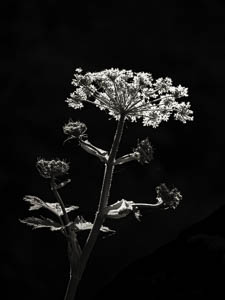
Original digital captureWhat I saw that I liked:I did a project in Kokoro about these sunbeams that make their way to the forest floor and illuminate a small patch of undergrowth. What I don't like in the picture:The one above is against a totally black background and looses its sense of being in the forest. This is a great example of why I talk so much about the importance of the details in those tones next door to black. What I learned:If you can't see anything coming out of those dead blacks, the context simply disappears. In all the images in this project, I had to raise the deep shadows a bit so they became visible. If these highlighted plants are seen in the context of the forest, they might easily look like studio still life images. 2nd Chances: What I might try nextThe one above might actually have some detail I could recover. I need to play around with it and see if there is anything in there that the camera captured that's buried in the blacks. |


