Every Picture Is a Compromise
Lessons from the Also-rans
Most photography websites show the photographer's very best work. Wonderful. But that's not the full story of a creative life. If we want to learn, we'd better pay attention to the images that aren't "greatest hits" and see what lessons they have to offer. Every picture is a compromise — the sum of its parts, optical, technical, visual, emotional, and even cosmic – well, maybe not cosmic, but sometimes spiritual. Success on all fronts is rare. It's ok to learn from those that are not our best.
This is a series about my also-rans, some of which I've been able to improve at bit (i.e., "best effort"), none of which I would consider my best. With each there are lessons worth sharing, so I will.
|
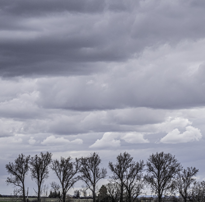
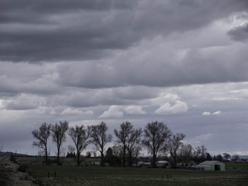
Original digital captureWhat I saw that I liked:That line of trees under the storm clouds. What I don't like in the picture:Why did I think this is a horizontal image? What I learned:The fundamental task of composition is to eliminate the unnecessary. The buildings in the image don't contribute a thing. In fact, they are distractions. I could have so easily eliminate them with a vertical composition. Because I didn't think about this at the time, my only choice is to crop the image into a vertical. I always hate throwing out this many pixels, but that's the price I have to pay for doing such a lousy job in the field. 2nd Chances: What I might try nextShould the clouds be that blue? Maybe this should be a b/w? |


