Every Picture Is a Compromise
Lessons from the Also-rans
Most photography websites show the photographer's very best work. Wonderful. But that's not the full story of a creative life. If we want to learn, we'd better pay attention to the images that aren't "greatest hits" and see what lessons they have to offer. Every picture is a compromise — the sum of its parts, optical, technical, visual, emotional, and even cosmic – well, maybe not cosmic, but sometimes spiritual. Success on all fronts is rare. It's ok to learn from those that are not our best.
This is a series about my also-rans, some of which I've been able to improve at bit (i.e., "best effort"), none of which I would consider my best. With each there are lessons worth sharing, so I will.
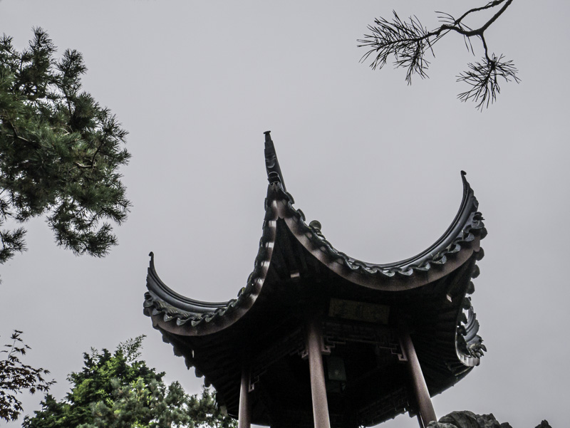
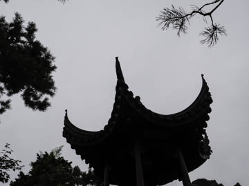
Original digital captureWhat I saw that I liked:For unknown reasons, I just love this type of composition that has a branch of pine poking into the empty sky from a corner. What I don't like in the picture:The problem with a branch like that is that it can look like a mistake just as easily as it can look like a clever composition. What I learned:I wish I knew some rule of thumb how to decide if that branch is a good idea or a cheeky and obvious mistake. This image is a good example. Is that branch a great idea or a silly one? I'm not sure. The two little branches on the top left are obviously ones that need to be cloned out. That bigger one in the upper right? I just can't decide. As a result, I've never used this image in project, nor have I ever printed it. 2nd Chances: What I might try nextWould it be a better composition if I twisted it clockwise so the vertical supports are rectified? |


