Every Picture Is a Compromise
Lessons from the Also-rans
Most photography websites show the photographer's very best work. Wonderful. But that's not the full story of a creative life. If we want to learn, we'd better pay attention to the images that aren't "greatest hits" and see what lessons they have to offer. Every picture is a compromise — the sum of its parts, optical, technical, visual, emotional, and even cosmic – well, maybe not cosmic, but sometimes spiritual. Success on all fronts is rare. It's ok to learn from those that are not our best.
This is a series about my also-rans, some of which I've been able to improve at bit (i.e., "best effort"), none of which I would consider my best. With each there are lessons worth sharing, so I will.
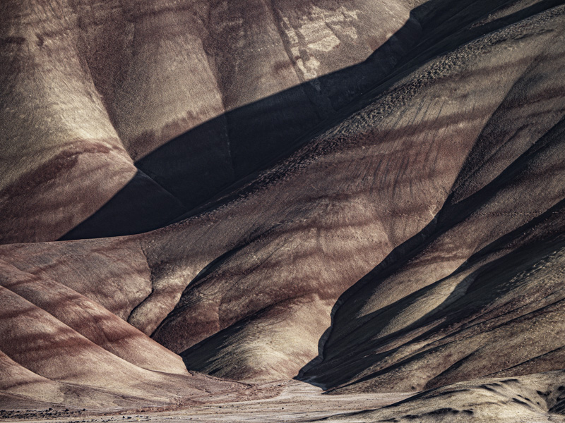
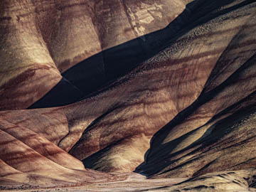
Original digital captureWhat I saw that I liked:The Painted Hills in central Oregon is a very popular photo spot. It's pretty cool, actually. What I don't like in the picture:The above is a straight capture without any adjustments or processing. It's a pretty faithful rendition of what you would see if you were standing there. What I learned:The problem to my eye, is that even though it's a faithful reproduction of the scene, it looks fake. That is, it looks like I've cranked up the colors for a photographic hyperbolic effect — even though I haven't. As a matter of personal taste, I'd much rather dial back on the colors by desaturating them a bit. The one at left feels more natural to my eye, yet still shows the colored layers in the bentonite. Others may think differently, but I'd much rather have a more believable and natural looking impression even if that means my dialed down image is the real fake. I'd rather my images are 20% under-saturated than 5% over-saturated. |


