Every Picture Is a Compromise
Lessons from the Also-rans
Most photography websites show the photographer's very best work. Wonderful. But that's not the full story of a creative life. If we want to learn, we'd better pay attention to the images that aren't "greatest hits" and see what lessons they have to offer. Every picture is a compromise — the sum of its parts, optical, technical, visual, emotional, and even cosmic – well, maybe not cosmic, but sometimes spiritual. Success on all fronts is rare. It's ok to learn from those that are not our best.
This is a series about my also-rans, some of which I've been able to improve at bit (i.e., "best effort"), none of which I would consider my best. With each there are lessons worth sharing, so I will.
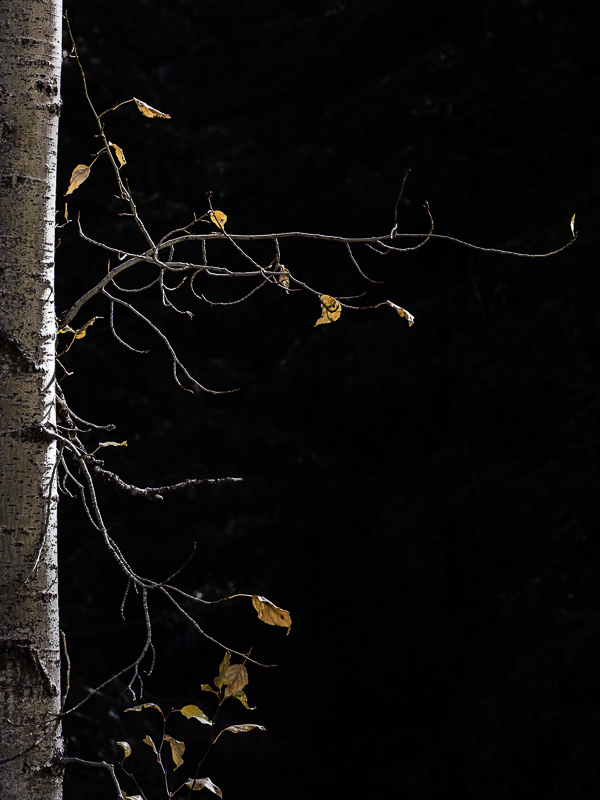
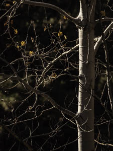
Original digital captureWhat I saw that I liked:Yellow leaves, white bark, backlit. I love the fall. What I don't like in the picture:I worked on this idea for almost two weeks, and they are failed. The "Rule of Thirds" didn't help. Getting a clean background wasn't the answer. I was really getting frustrated. What I learned:Why do I need the entire tree trunk? All the previous attempts showed the full trunk width and the limbs out the short side were distracting. So just eliminate them! By golly, it worked. 2nd Chances: What I might try nextI may have over-sharpened this one. I need to play around with it to see if this is so. |


