Every Picture Is a Compromise
Lessons from the Also-rans
Most photography websites show the photographer's very best work. Wonderful. But that's not the full story of a creative life. If we want to learn, we'd better pay attention to the images that aren't "greatest hits" and see what lessons they have to offer. Every picture is a compromise — the sum of its parts, optical, technical, visual, emotional, and even cosmic – well, maybe not cosmic, but sometimes spiritual. Success on all fronts is rare. It's ok to learn from those that are not our best.
This is a series about my also-rans, some of which I've been able to improve at bit (i.e., "best effort"), none of which I would consider my best. With each there are lessons worth sharing, so I will.
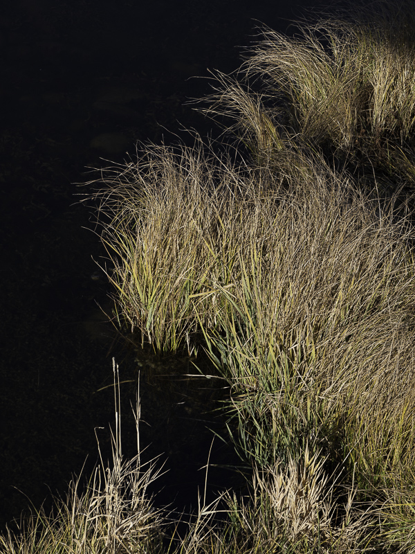
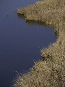
Original digital captureWhat I saw that I liked:Grasses next to water always offer a fun contrast of color and etexture. What I don't like in the picture:I know I repeatedly say that the challenge of photography is to organize and distill the chaos of the world into some sort of visual order, but that can be overdone. The above is too simple. Particularly that expanse of water is featureless. Where are the ducks when yoiu need them? What I learned:A little complexity is a good thing. The one at left is just downstream a few yards from the above. A deeper shadow turns the water dark and the sun had gone down a bit which improved the angullar light on the grasses. More complex than the one above, but in this case I think it helps. 2nd Chances: What I might try nextThere is a horizontal grass behind the two vertical ones in the lower left corner. I should clone it out of existence. |


