Every Picture Is a Compromise
Lessons from the Also-rans
Most photography websites show the photographer's very best work. Wonderful. But that's not the full story of a creative life. If we want to learn, we'd better pay attention to the images that aren't "greatest hits" and see what lessons they have to offer. Every picture is a compromise — the sum of its parts, optical, technical, visual, emotional, and even cosmic – well, maybe not cosmic, but sometimes spiritual. Success on all fronts is rare. It's ok to learn from those that are not our best.
This is a series about my also-rans, some of which I've been able to improve at bit (i.e., "best effort"), none of which I would consider my best. With each there are lessons worth sharing, so I will.
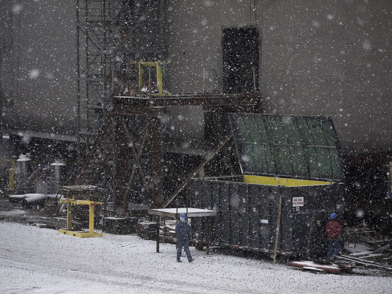
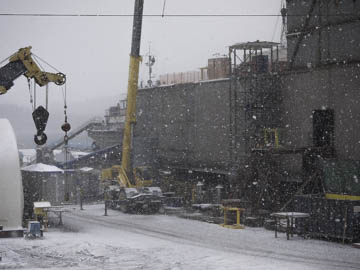
Original digital captureWhat I saw that I liked:A heavy snowfall across the street at the Dakota Creek shipyard. What I don't like in the picture:Well, neither is a photograph I'm fond of, but these two do allow me to illustrate an important point — the human element. What I learned:The shot above was first. A few moments later, I made the shot at left. When I look at these two shots, there is a major difference. The one above makes my want to scan the image for a point of interest. I don't find one. When viewing the one at left, my eye is instantly drawn to the person walking in the snow. That person is pretty small compared to the rest of the composition. Isn't it interesting how our eye finds the person instantly? I wonder if this genetically driven. There is nothing in the composition that points to that person, so I think our eyes are conditioned to see the human form. Perhaps that's what my eye is searching for when it scans the above image. 2nd Chances: What I might try nextThis was shot with an early Panasonic G1 camera with 12 megapixels. Maybe I can crop it just a bit closer. |


