Every Picture Is a Compromise
Lessons from the Also-rans
Most photography websites show the photographer's very best work. Wonderful. But that's not the full story of a creative life. If we want to learn, we'd better pay attention to the images that aren't "greatest hits" and see what lessons they have to offer. Every picture is a compromise — the sum of its parts, optical, technical, visual, emotional, and even cosmic – well, maybe not cosmic, but sometimes spiritual. Success on all fronts is rare. It's ok to learn from those that are not our best.
This is a series about my also-rans, some of which I've been able to improve at bit (i.e., "best effort"), none of which I would consider my best. With each there are lessons worth sharing, so I will.
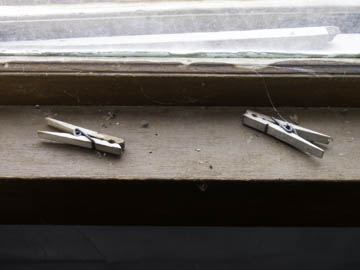
Original digital captureWhat I saw that I liked:Forget that we see old clothespins, dead bees, and spiderwebs on the window sill. I want to make a point about numbers. What I don't like in the picture:The image above is a visual ping pong. With the two dominant subjects, our eye bounces back and forth, back and forth. It's a linear movement that's hard to break away from. What I learned:There is an old maxim in graphic design that praises odd numbers in composition. One is better than two, three is better than two. Compose in 1, 3, 5, 7. Although I'm not a fan of "bulls-eye composition," the one clothespin at left at least allows our eye to wander up to the dead bee and see the spider webs more consciously. If there had been a third clothespin, that might have been even better. 2nd Chances: What I might try nextClever Photoshop folks might just clone in a third clothespin. |


