Every Picture Is a Compromise
Lessons from the Also-rans
Most photography websites show the photographer's very best work. Wonderful. But that's not the full story of a creative life. If we want to learn, we'd better pay attention to the images that aren't "greatest hits" and see what lessons they have to offer. Every picture is a compromise — the sum of its parts, optical, technical, visual, emotional, and even cosmic – well, maybe not cosmic, but sometimes spiritual. Success on all fronts is rare. It's ok to learn from those that are not our best.
This is a series about my also-rans, some of which I've been able to improve at bit (i.e., "best effort"), none of which I would consider my best. With each there are lessons worth sharing, so I will.
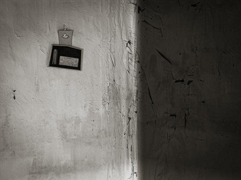
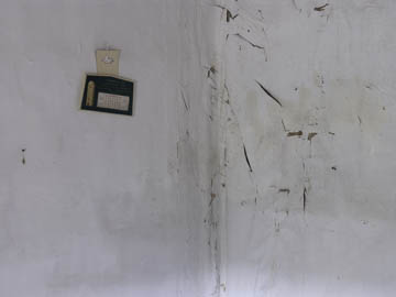
Original digital captureWhat I saw that I liked:I enjoy this type of minimalist composition. What I don't like in the picture:In the above, the light is flat and gray, and there is an odd glow of light at the bottom edge. What I learned:I decided to create a fake shadow by darkening the right side of the image. Interestingly enough, to my eye that inverted the corner. That is to say, in the above, the corner recedes from my position whereas in the version at left the corner seems closer to me than the calendar. It's an optical illusion, but I think it works in this instance. 2nd Chances: What I might try nextShould I darken that lower edge some more? |


