Every Picture Is a Compromise
Lessons from the Also-rans
Most photography websites show the photographer's very best work. Wonderful. But that's not the full story of a creative life. If we want to learn, we'd better pay attention to the images that aren't "greatest hits" and see what lessons they have to offer. Every picture is a compromise — the sum of its parts, optical, technical, visual, emotional, and even cosmic – well, maybe not cosmic, but sometimes spiritual. Success on all fronts is rare. It's ok to learn from those that are not our best.
This is a series about my also-rans, some of which I've been able to improve at bit (i.e., "best effort"), none of which I would consider my best. With each there are lessons worth sharing, so I will.
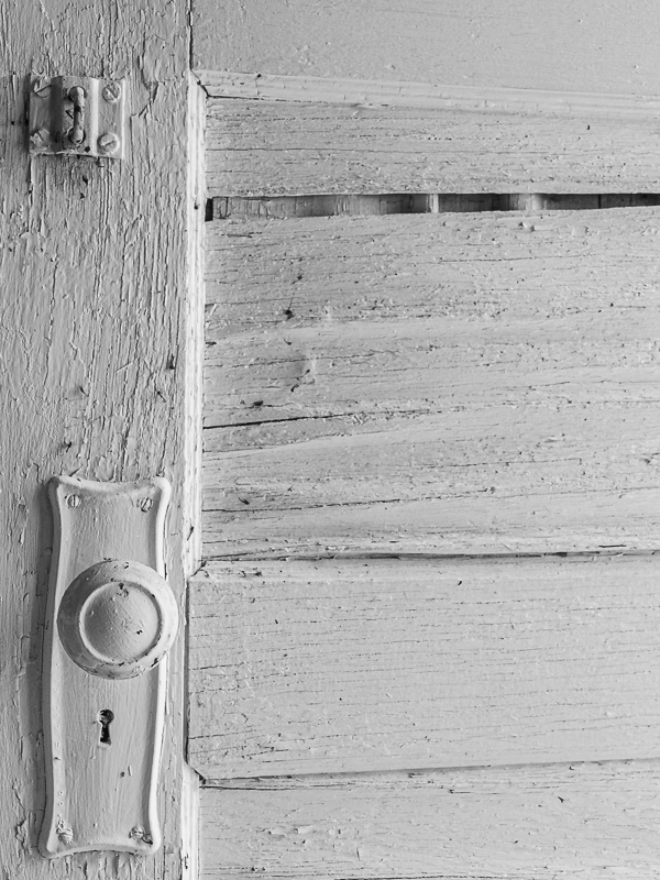
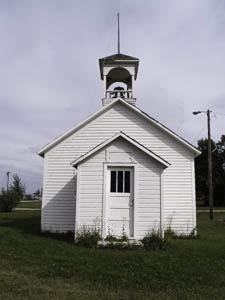
Original digital captureWhat I saw that I liked:What's not to like in a pioneer schoolhouse? What I don't like in the picture:This is an ideal example of an overall shot versus a detail shot. What I learned:I almost always prefer the detail shot compared to the overall shot — at least if I had to pick one or the other. The detail shot feels more intimate, tactile, immediate. Unfortunately, it is without context — which is where the overall shot excels. One of the cleverest solutions to this dichotomy I saw in an exhibition. The presentation of each large detail shot included next to it in an information placard, a small image of the overall location along with the title, date, price, etc. We could then see the context of the detail. The image on the placard wasn't artwork, but simply the background needed to understand more about the detail shown in the art frame. Very clever. 2nd Chances: What I might try nextI wish there was just a bit more to the left of the doorknob. I wonder if I could do a clever enough job in Photoshop to add another 1/2 inch to the image? |
|


