Every Picture Is a Compromise
Lessons from the Also-rans
Most photography websites show the photographer's very best work. Wonderful. But that's not the full story of a creative life. If we want to learn, we'd better pay attention to the images that aren't "greatest hits" and see what lessons they have to offer. Every picture is a compromise — the sum of its parts, optical, technical, visual, emotional, and even cosmic – well, maybe not cosmic, but sometimes spiritual. Success on all fronts is rare. It's ok to learn from those that are not our best.
This is a series about my also-rans, some of which I've been able to improve at bit (i.e., "best effort"), none of which I would consider my best. With each there are lessons worth sharing, so I will.
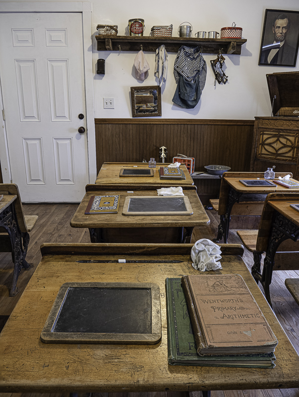
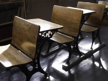
Original digital captureWhat I saw that I liked:Pioneer school student desks. I had one of these as a child that my parents added to my bedroom when I was six years old. What I don't like in the picture:A good example of "we live, we learn." The above was shot in 2006; the image at left was shot in 2022. What I learned:The above shows a picture of a thing; the picture at left shows a first person experiential point of view. I much prefer the one at left, but I wish I had move two rows to the left to include the teacher's desk at the top of the image instead of a shelf and the door. Also, the one above what shot with a 35mm eq lens at f/8 to deepen the depth of field enough so it would be sharp. The one at left was shot with at 24mm eq at f/4 using focus stacking. 2nd Chances: What I might try nextWhat if I crop off the top of the image at left? Would loosing Lincoln diminish the feel? |


