Every Picture Is a Compromise
Lessons from the Also-rans
Most photography websites show the photographer's very best work. Wonderful. But that's not the full story of a creative life. If we want to learn, we'd better pay attention to the images that aren't "greatest hits" and see what lessons they have to offer. Every picture is a compromise — the sum of its parts, optical, technical, visual, emotional, and even cosmic – well, maybe not cosmic, but sometimes spiritual. Success on all fronts is rare. It's ok to learn from those that are not our best.
This is a series about my also-rans, some of which I've been able to improve at bit (i.e., "best effort"), none of which I would consider my best. With each there are lessons worth sharing, so I will.
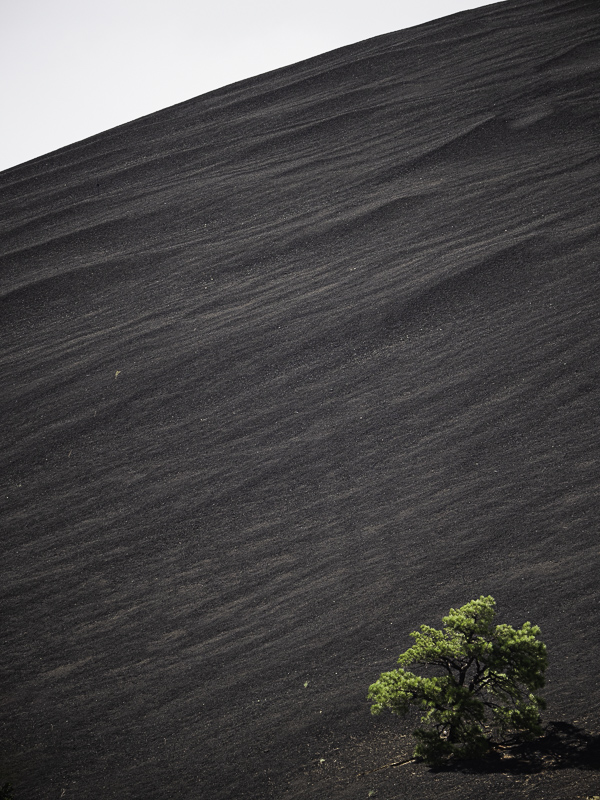
Original digital captureWhat I saw that I liked:The contrast of the massive hill of pumice compared to the small tree. What I don't like in the picture:Which version of this shot looks steeper to you? What I learned:In the version above, for reasons I can't put my finger on, the hillside looks smaller than in the version at left. It must have something to do with that triangle of sky in the upper left. In the version above, that triangle of sky looks like a mistake; in the version at left, the angle of the hill seems steeper. Maybe a bit of an optical illusion? 2nd Chances: What I might try nextI've often wondered if an image like this looks better if it is framed high on the wall, close to the ceiling. Would it seem steeper depending on whether we are looking straight at it or looking up at it? |


