Every Picture Is a Compromise
Lessons from the Also-rans
Most photography websites show the photographer's very best work. Wonderful. But that's not the full story of a creative life. If we want to learn, we'd better pay attention to the images that aren't "greatest hits" and see what lessons they have to offer. Every picture is a compromise — the sum of its parts, optical, technical, visual, emotional, and even cosmic – well, maybe not cosmic, but sometimes spiritual. Success on all fronts is rare. It's ok to learn from those that are not our best.
This is a series about my also-rans, some of which I've been able to improve at bit (i.e., "best effort"), none of which I would consider my best. With each there are lessons worth sharing, so I will.
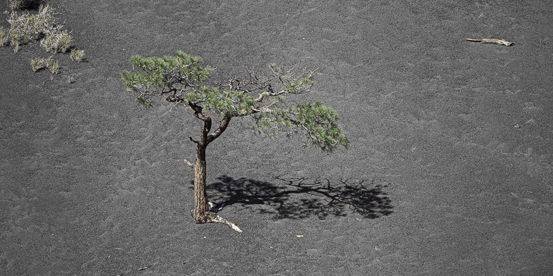
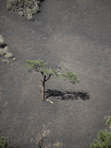
Original digital captureWhat I saw that I liked:A very cool tree and shadow on the cinder cone of Sunset Crater near Flagstaff. What I don't like in the picture:Far too many distracting elements that have to go. What I learned:I didn't intend this to be a pano, but that sure did solve the problems of the distractions in the above version. If there is a lesson here, I guess it might be that creative cropping is a valid tool for solving problems. I remember an image of Jay Dusards that was a pano with rounded corners on the top. I asked him about this and he said it was the only way he could resolve some severe vignetting from his wide angle lens. Creative cropping, indeed! 2nd Chances: What I might try nextI need to print this one to see if the texture in the cinders is okay or an over-sharpened problem. |


