Every Picture Is a Compromise
Lessons from the Also-rans
Most photography websites show the photographer's very best work. Wonderful. But that's not the full story of a creative life. If we want to learn, we'd better pay attention to the images that aren't "greatest hits" and see what lessons they have to offer. Every picture is a compromise — the sum of its parts, optical, technical, visual, emotional, and even cosmic – well, maybe not cosmic, but sometimes spiritual. Success on all fronts is rare. It's ok to learn from those that are not our best.
This is a series about my also-rans, some of which I've been able to improve at bit (i.e., "best effort"), none of which I would consider my best. With each there are lessons worth sharing, so I will.
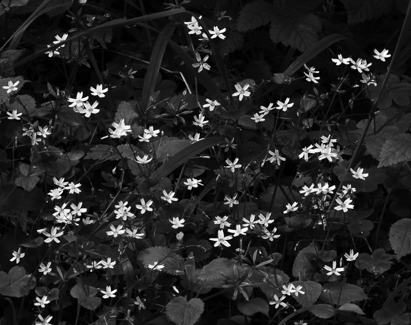
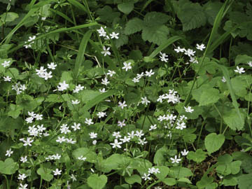
Original digital captureWhat I saw that I liked:A burst of blossoms. What I don't like in the picture:The above full color version has the blossoms alright, but the image is almost more about the color green than it is about the white blossoms. What I learned:A classic case of why black-and-white image are still a valid medium in today's RGB color age. A simple conversion to b/w and the photograph become all about the blossoms — which what my intent. A constant refrain in discussions about composition is to "eliminate the unnecessary." The same can be said about color versus b/w. If the intent is to bring attention to the blossoms, why retain the green? 2nd Chances: What I might try nextPerhaps a little more finessing is necessary to get just the right shadow details. I need to play around with this image a bit more. |


