Every Picture Is a Compromise
Lessons from the Also-rans
Most photography websites show the photographer's very best work. Wonderful. But that's not the full story of a creative life. If we want to learn, we'd better pay attention to the images that aren't "greatest hits" and see what lessons they have to offer. Every picture is a compromise — the sum of its parts, optical, technical, visual, emotional, and even cosmic – well, maybe not cosmic, but sometimes spiritual. Success on all fronts is rare. It's ok to learn from those that are not our best.
This is a series about my also-rans, some of which I've been able to improve at bit (i.e., "best effort"), none of which I would consider my best. With each there are lessons worth sharing, so I will.
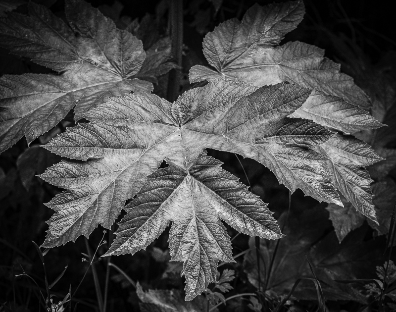
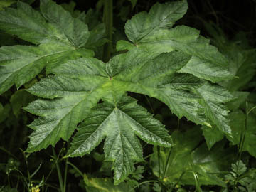
Original digital captureWhat I saw that I liked:One of my favorite images that seriously influenced my early days in photography is that image of the glowing ferns by Ansel Adams, Ferns, Mount Rainier National Park, 1942. What I don't like in the picture:Just as in yesterday's EPIC image, the green in the above adds nothing to the photograph. What I learned:If asked about what this picture is "about," I'd say it's about the sheen on the leaves. Green and sheen are two different properties. A quick conversion to b/w and the sheen dominates as it should. 2nd Chances: What I might try nextI have a lot of these leaf-sheen images. Does it become boring and repetitive if I assemble them into a multi-image project? How do I avoid the trap of repetition? |


