Every Picture Is a Compromise
Lessons from the Also-rans
Most photography websites show the photographer's very best work. Wonderful. But that's not the full story of a creative life. If we want to learn, we'd better pay attention to the images that aren't "greatest hits" and see what lessons they have to offer. Every picture is a compromise — the sum of its parts, optical, technical, visual, emotional, and even cosmic – well, maybe not cosmic, but sometimes spiritual. Success on all fronts is rare. It's ok to learn from those that are not our best.
This is a series about my also-rans, some of which I've been able to improve at bit (i.e., "best effort"), none of which I would consider my best. With each there are lessons worth sharing, so I will.
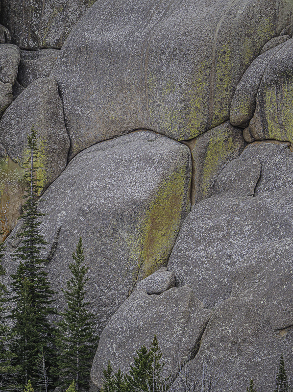
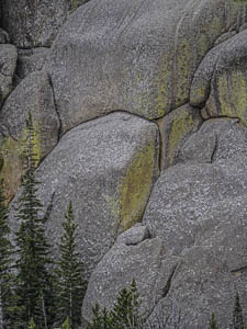
Original digital captureWhat I saw that I liked:The lines in the granite wall, framed by the tree on the right. What I don't like in the picture:I do my best in the field to be sure that I don't rotate the camera and throw verticals off by a degree or two. I try, but I often fail. I'm just not that accurate when I handhold the camera. What I learned:The above isn't awful, but that left tree is slightly off. It isn't straight. Worse, because it is so close to the edge of the frame, it's off-kilterness is more visible. Stuff like this just bugs me. The image at left was rotated a whopping 1.49° to visually make that tree parallel to the edge of the frame. Whew! I can breathe again! Sometimes it's the tiniest details that can bugger up an image. 2nd Chances: What I might try nextI'm tempted to lighted the rocks just a bit. |


